CUNY Graduate Center Library
My Role
UX Researcher
Visual Designer
Duration
3 months
Overview
The City University of New York (CUNY) Graduate Center Library has decided that their website no longer meets the needs of their users and have “hired” us to perform a total website re-design. Since doctoral students make up a large portion of their users and the library doesn’t have a large physical footprint (which means they don’t have a large physical collection), their InterLibrary Loan (ILL) service is one of the most important services offered by the library.
We had a meeting with our clients, the staff of CUNY Graduate Center library. They told us their consideration and expectation of the website as well as showing us some model sites.
Learning Stakeholders’ Pain Points
- Flat Information Architecture. Due to a “phobia” of creating deep menus, the site’s information architecture is very flat. In an effort to avoid deep navigation menus, the page instead uses long pages with information presented in an accordion-style menu instead of sub-pages.
- Diverse Stakeholder Perspectives. The library has many departments and services, and each has a slightly different perspective on what the website should do. Incorporating these varied perspectives is a key challenge.
Preparing User Research
To understand users’ preferences, I interviewed six people including one graduate student, two librarians, and three teachers from CUNY Graduate Center. Our team spread out both paper and online questionnaires to the users and got 28 results in total. According to the interview and the questionnaire results. We came up with the insights below:
- The clean and simply designed website is more preferred than the website with many links.
- Students like to use OneSearch rather than search in the databases. In contrast, faculty members use database more.
- Users do not follow the library social media.
- Not many users tend to ask librarians online.
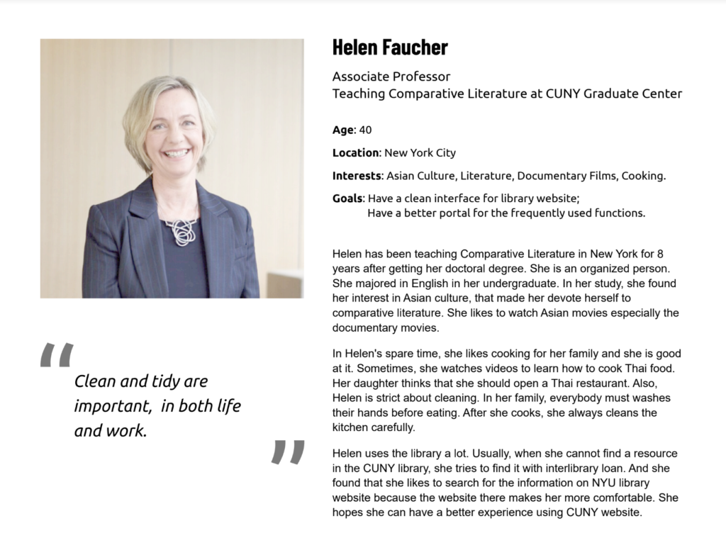
Based on the insights, I created a persona to help target the user group.
Exploring I. A. Using Card Sorting & Tree Testing Methods
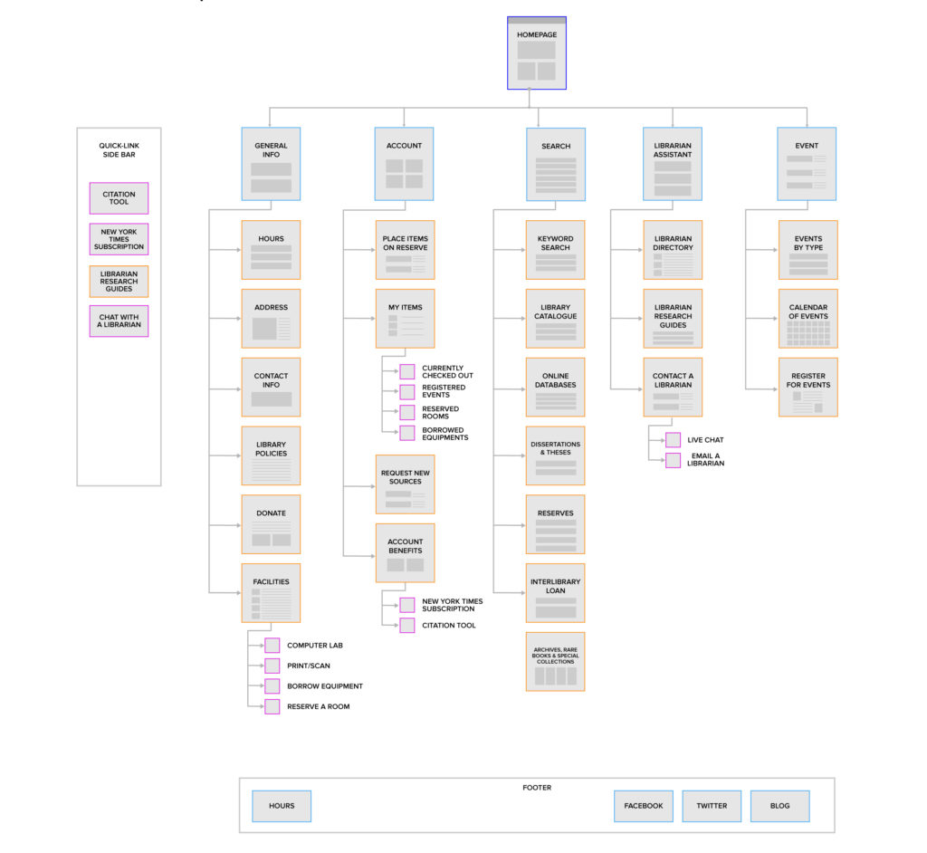
According to the research result and the current content of CUNY library website, we conducted the card sorting tests with 8 users. With the card sorting, we could know how users would like to categorize the items on the website. Then, according to the card sorting result, we built our site structure and conducted the tree testing with users to get more of their feedback.
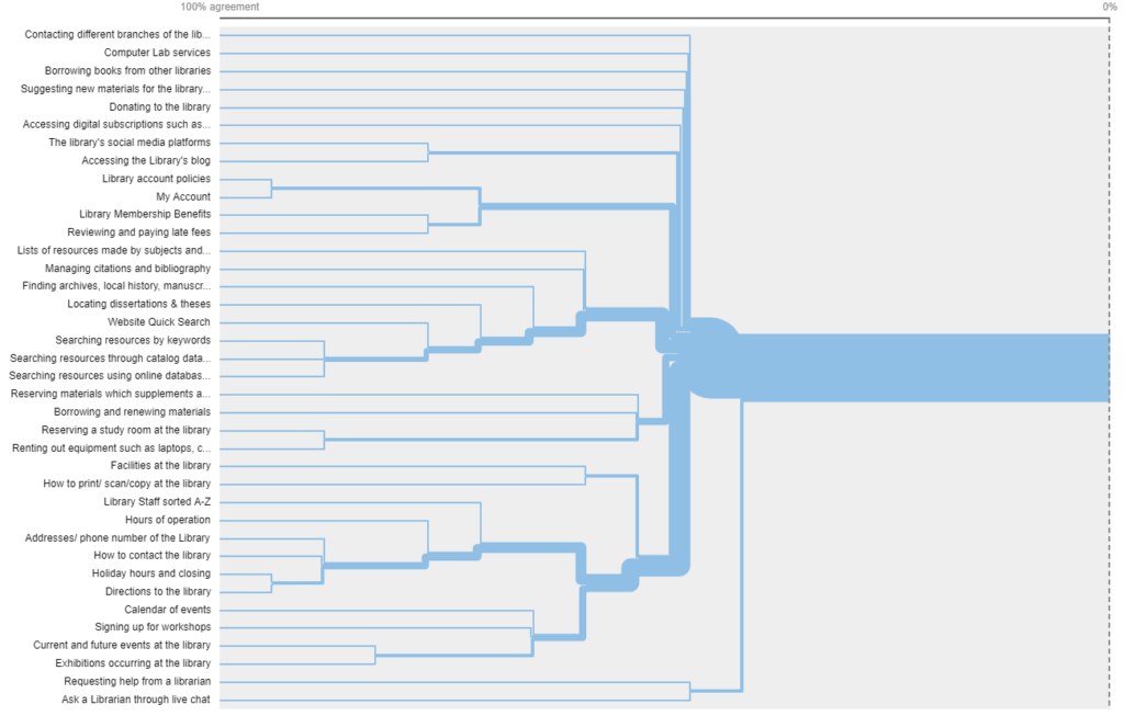
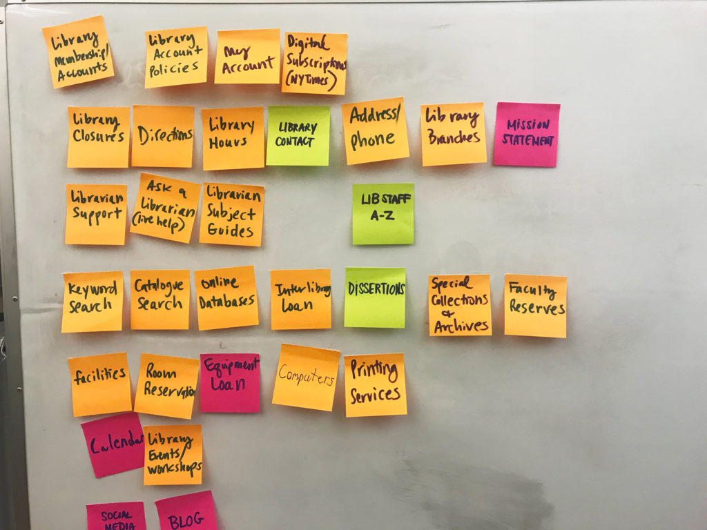
Through these two methods, we found some useful insights below and created the sitemap.
- Some menu items are inherently difficult to find within a navigational structure.
- Searches of various types were categorized together
- The “My Items” section should be under the “Account” section.
- “Librarian Assistance” and “Search” can become default selections.
Conducting Competitive Analysis
There are some good model websites from both our research and the client’s recommendation. We evaluated the usability Google, Cornel University Library, Duke University Library, Columbia University Library and Boston College Library. In the analysis, six dimensions were selected to evaluate the websites based on recurring topics in our user research: home page, site navigation, page organization, search, style, and mobile-friendliness. Each dimension was rated using a scale of 1 to 3, with 1 being the lowest and 3 being the highest. The evaluation of these dimensions provided us with valuable insights into a redesign of the CUNY Grad Center Library website.
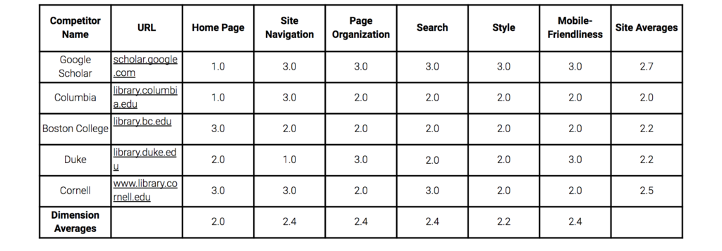
From our analysis of the competition, we found that consistent use of style elements across browser sizes, an intuitive page layout, well-organized menu hierarchy, and search functionality should help to enhance the user’s experience.
Wireframing & User Testing
For the web design, we wanted to make the website responsive to match the client’s anticipation. So we decided to set up two tasks including one for the desktop version and one for the mobile version. Each task requires a different workflow. Also, there is more than one way to finish each task.
- Task 1: Request a book called “Lean UX” through Interlibrary Loan.
- Task 2: Find a database called “JSTOR.”
Then, based on the tasks, we made our first version low-fidelity prototype with Sketch and used InVision to test its usability.
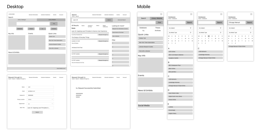
After the user testing, we summarized the insights below:
- Users would like to check the availability of the book before requesting it through ILL.
- Users would like to see the detail of the resource they are looking for before they request it through ILL.
- Users would like to use the search bar to find the database when they are looking for a specific one.
- The general information should not be at a high level on the homepage.
Building Responsive Hi-fi Prototype
After the prototype testing, we decided to change the Task 2 since it was too similar to Task 1. The new task is to find an event called “Zotero on Your Laptop: Basics” and register for it. We conducted more user testing for the new task and started to frame our high-fidelity prototype.
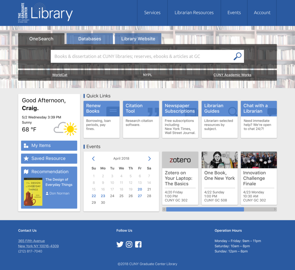
For the search function on the homepage, there are three tabs on the search bar, OneSearch, Database and Library Website. With these three tabs, the users can search everything in the library and on the library website. Under the search bar, there are three external links which are also a part of search section but different databases. Under Search, there is a personal information sidebar on the left showing the weather and the items related to the user’s account including “My Items, Saved Resources, and Recommendation.” By adding this section, we wanted to make users feel more welcome and see their exclusive resources at first glance. Next, we have the five quick links with descriptions for each one. These quick links were selected according to the card sorting and tree testing. The descriptions help users better understand the functions of the links. Below the quick links, there is the event section. The client wanted more than one event to be shown on the website. So we have a calendar with the dates with events highlighted. All the upcoming events are shown next to the calendar. By clicking on a specific date, users can see the events happening on that day. On the bottom of the page, there are contact information and address, operation hours and the social media links.
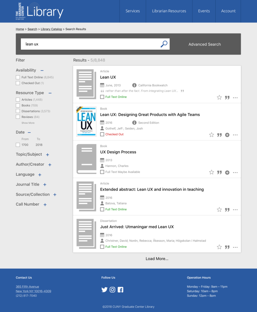
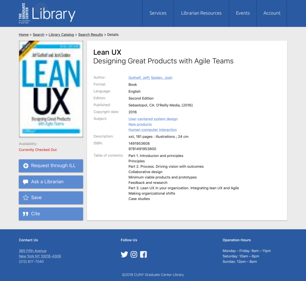
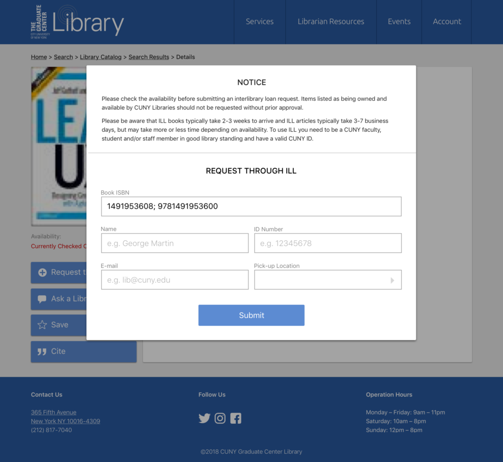
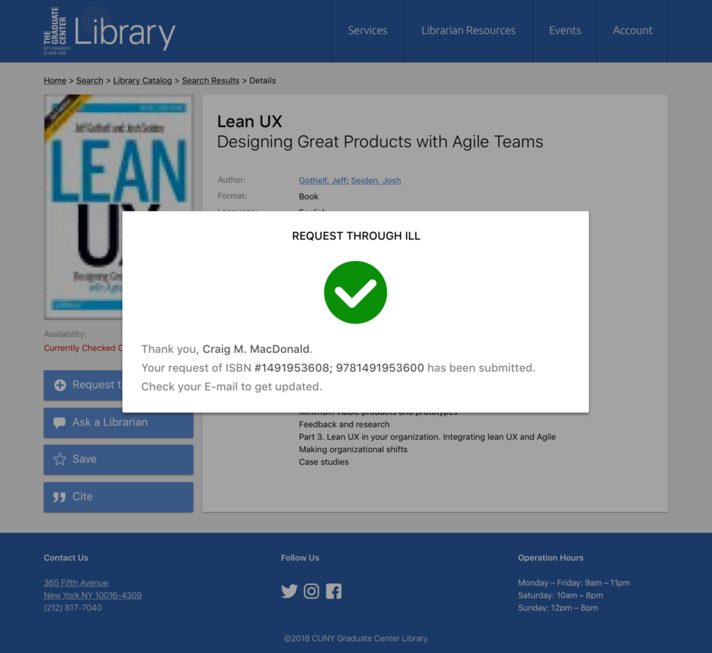
For the search results page, we added the advanced search button to the search bar. The current CUNY search filter is pretty comprehensive but the users would more like to see the filters on the left. For the result list, I made all the icons to highlight the important information. According to the research, the availability of the resource must be shown on the list. For the book detail page, we choose “Request through ILL, Cite, Save and Contact a Librarian” as the sidebar menu items. By clicking on “Request through ILL,” the prompt will show and the book information code has already been prefilled. The user just needs to fill out the personal information to process the requesting.
For the mobile homepage, we got rid of the personal information section, quick link descriptions, and the event calendar to make it more concise. Also, the navigation bar is folded to keep the visual balance.
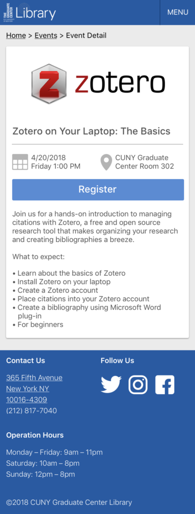
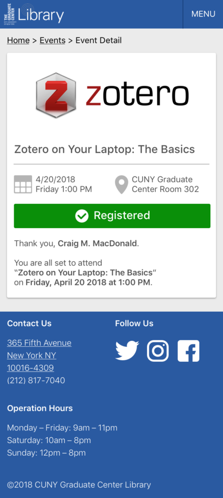
For the event detail page, we use icons to highlight the time and the location and maintain them on each event screen to make sure users can find it on the first screen. On the registration form, users only need to fill out the name and Email to register the event.
Reflection & Implementing Components
We presented the project to stakeholders at CUNY Grad Center and received very positive feedback. Since we were using a grid system throughout the design, it is Bootstrap, Angular friendly, and easy to implement. Some of the components from our design were used on the current Grad Center website. With the brand new digital experience, Students and Faculty at CUNY will find resources more efficiently.
OTHER PROJECTS

