Aon
My Responsibilities_
UX Designer
Illustrator
Duration_
12 weeks
Overview_
AICPA(American Institute of Certified Public Accountants) Insurance Program is a series of insurance plans exclusively for over 400,000 AICPA members. The program was provided by Aon – a leading global Insurance firm. They offer insurance plans including personal products such as life insurance, auto/home insurance and long-term disability insurance as well as business products such as professional liability and cyber coverage. Aon partners with other leading insurance companies including Prudential, CNA, and Liberty Mutual to get valuable plans for AICPA members.
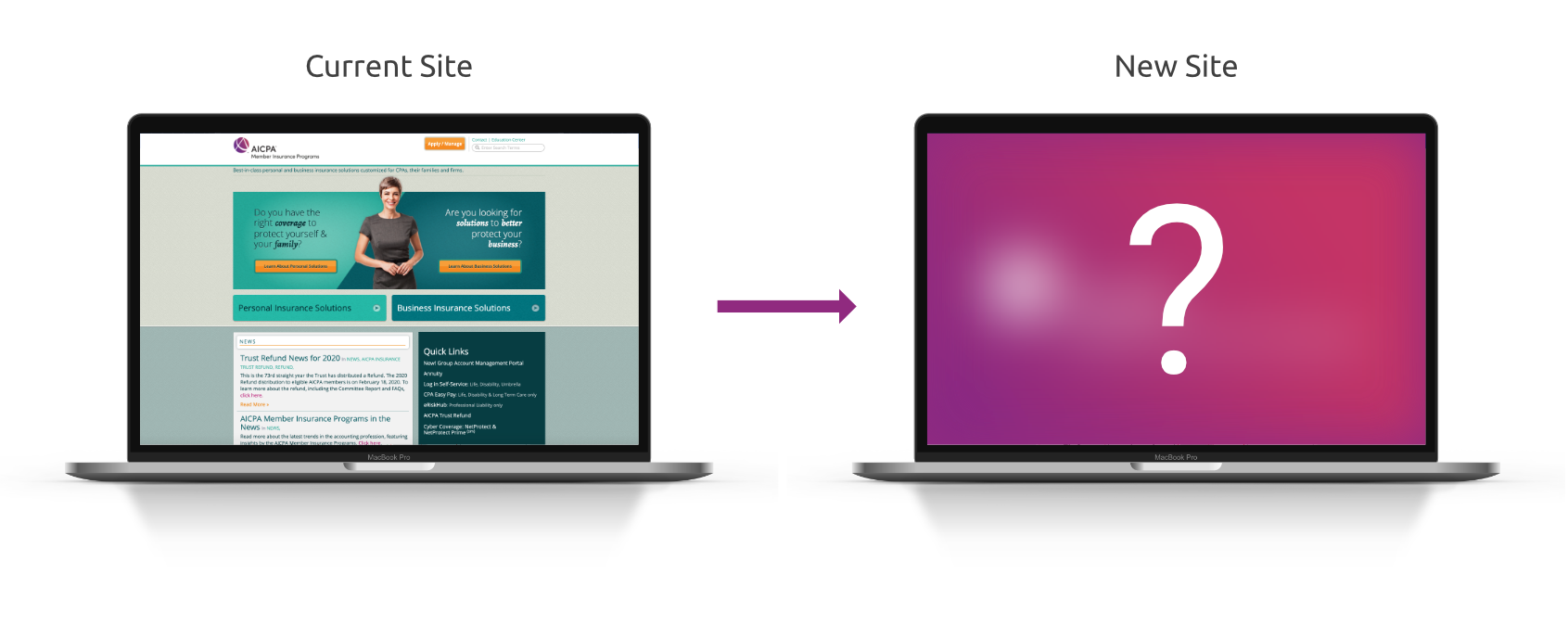
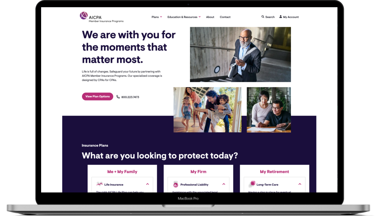
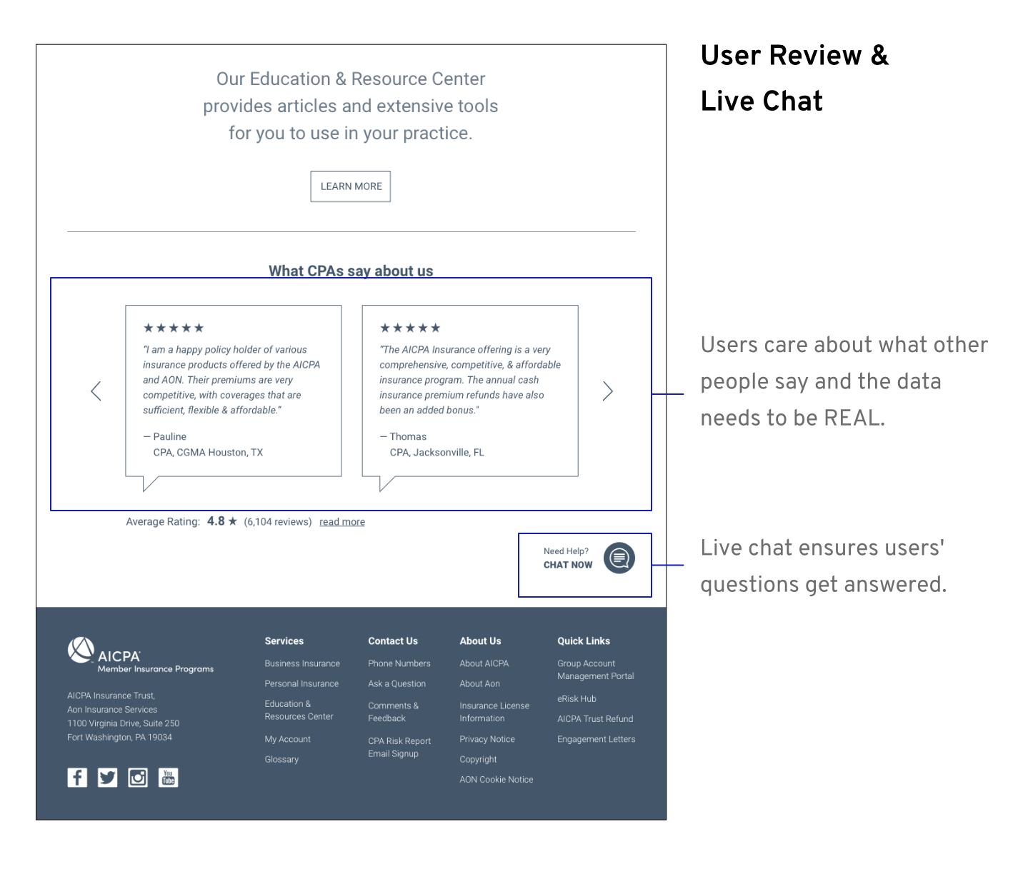
The current site was built 10 years ago and has dated design and insufficient maintenance. The purpose of this project is to design and introduce a better user experience of the site to AICPA Insurance Program customers.
We’ve done project sprint zero which was composed of a series of stakeholder workshops, user research (competitive analysis, user interviews, data analytics and journey mapping), design (wireframing, prototyping and user testing). We wanted to find out the key issues and make an initial proposal. I worked on this project as a UX designer at Mindtree. Below are members of the core team.
• • •
Stakeholders’ Concerns & Critiques on Website_
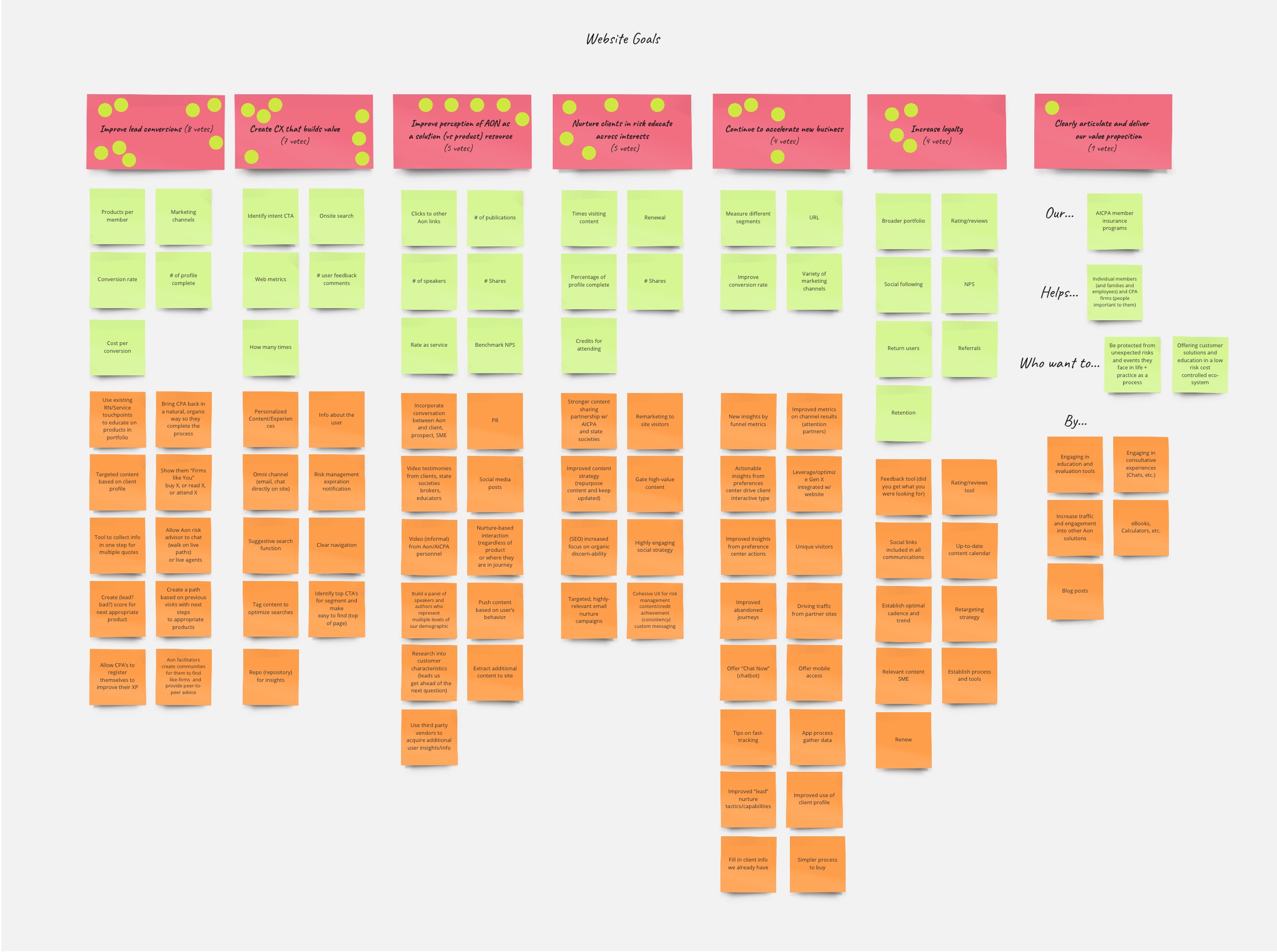
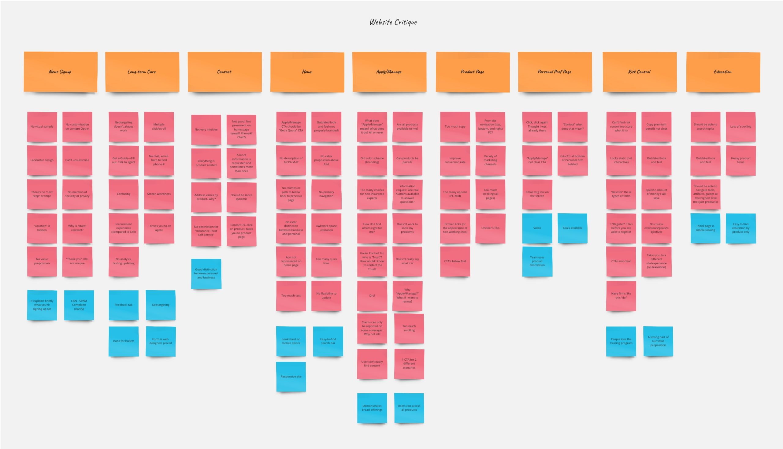
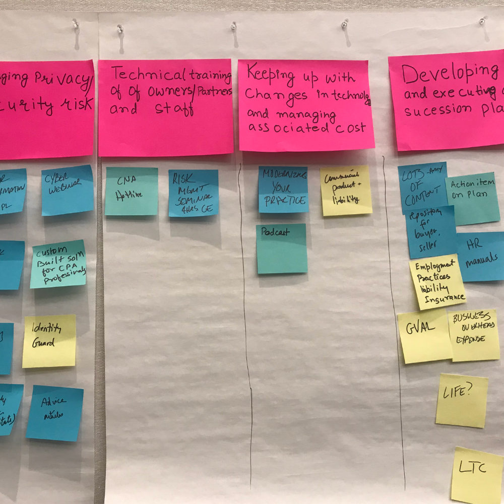
To find out key issues of the current AICPA Insurance Program site, we conducted a series of workshops with stakeholders – Clients from Aon’s marketing and product teams. Between workshops, we would summarize the feedback from clients and conduct needed research accordingly. Since a lot of affinity maps would be created during the workshops, we used Miro, a powerful online collaboration tool, which allowed us to work with both on-site and off-site clients.
As we received too many negative comments on the current website, they can be summarized as below:
- Lack of intuitive visual cue that can guide first-time users.
- Some language is confusing even for existing users. The search bar has been used a lot for a simple login feature.
- Product pages have too much copy and no clear information hierarchy.
- Users need to click too many times to finish one task (e.g. get an insurance quote).
- Page layouts are inconsistent throughout the site.
• • •
Learning How Competitors are Doing_
Through the workshop sessions, we identified competitors of AICPA Insurance Program and collected the stakeholders’ ideas on what aspects of them we should use as references. We synthesized the physical post-its with the post-its on Miro. And this massive competitor information board is what we got.
However, although clients endorse good features of some sites. Most insurance sites feature boring elements and interactions. It’s understandable that insurance is a relatively more serious industry, therefore, one of the challenges will be finding a good balance on visual design.
• • •
Discovering Who Users Are & What They Need_
In order to understand user behavior and create user-centered experience, we wanted to convert the research data into personas and journey maps. Fortunately, we were able to identify user groups, purchasing triggers, and touch points with the salesforce database of over 200,000 users’ data and a good marketing team providing accurate user demographics.
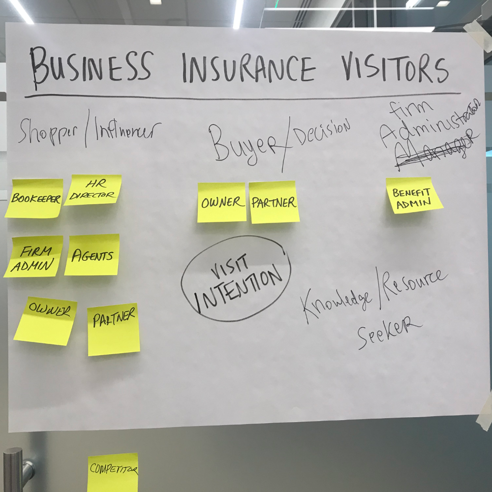
Business Insurance Visitors (Users)

Purchasing Triggers
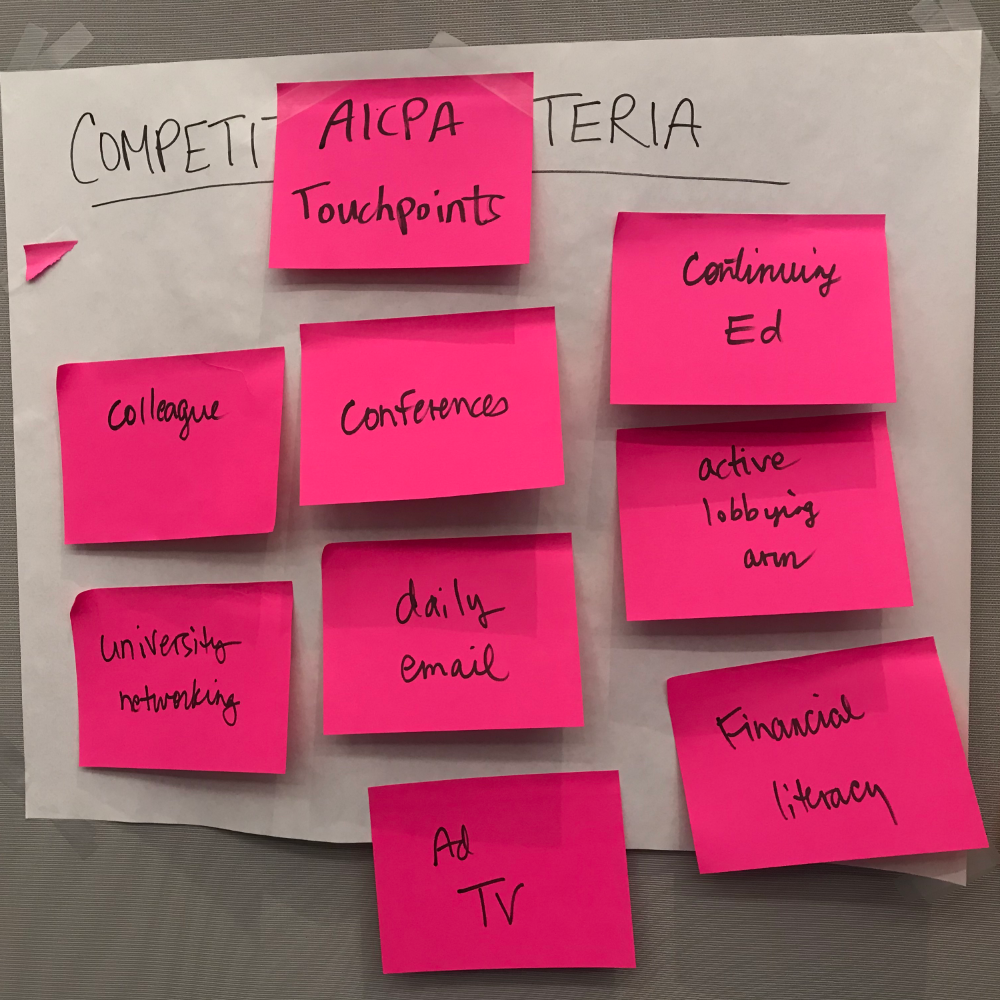
Touchpoints
With user groups, touch points, and purchasing triggers identified, we were also able to come up with some brief user stories using a very minimal yet efficient template.
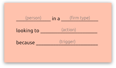
Over the workshop session, we came up with over 20 user stories, and let the stakeholders vote for the more important ones which we would be using to create the MVP user flows.
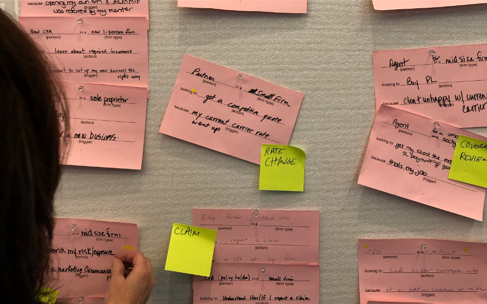
User Stories
• • •
Interviewing 7 Customers to Reinforce User Profiles_
Other than the stakeholders’ input, the feedback from our customers, CPAs, would be important to support our hypothesis and help us explore more ideas. We interviewed 7 users at the research stage and the feedback would help us create personas and journey maps.
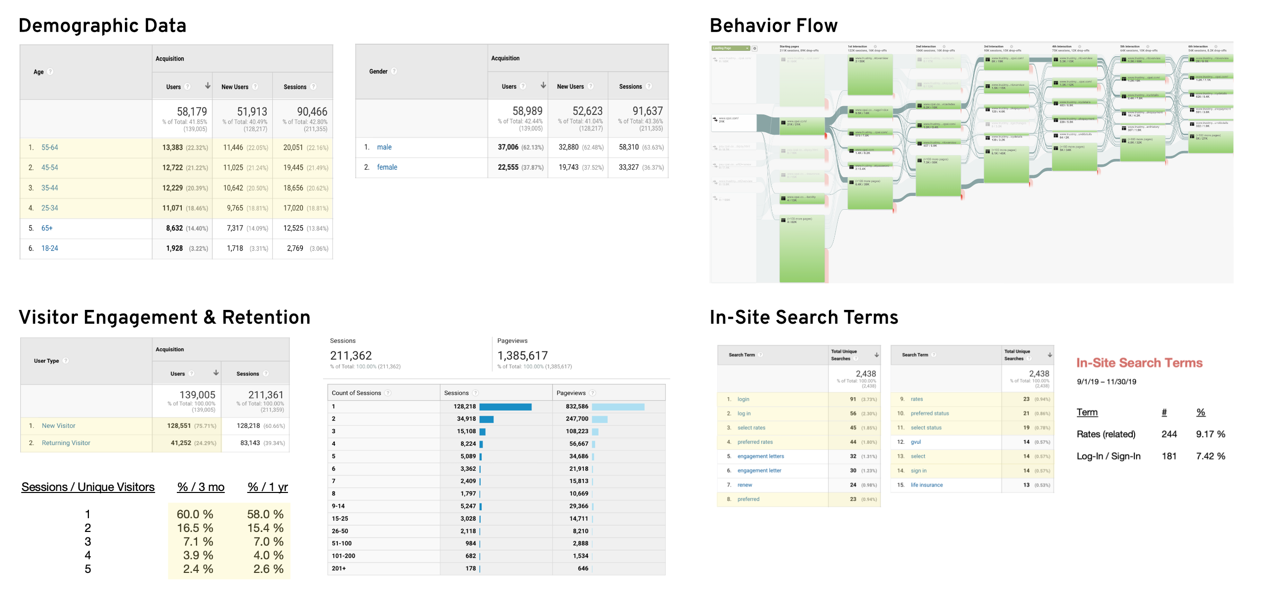
Using Google Analytics Data to Prioritize the Right User Groups_
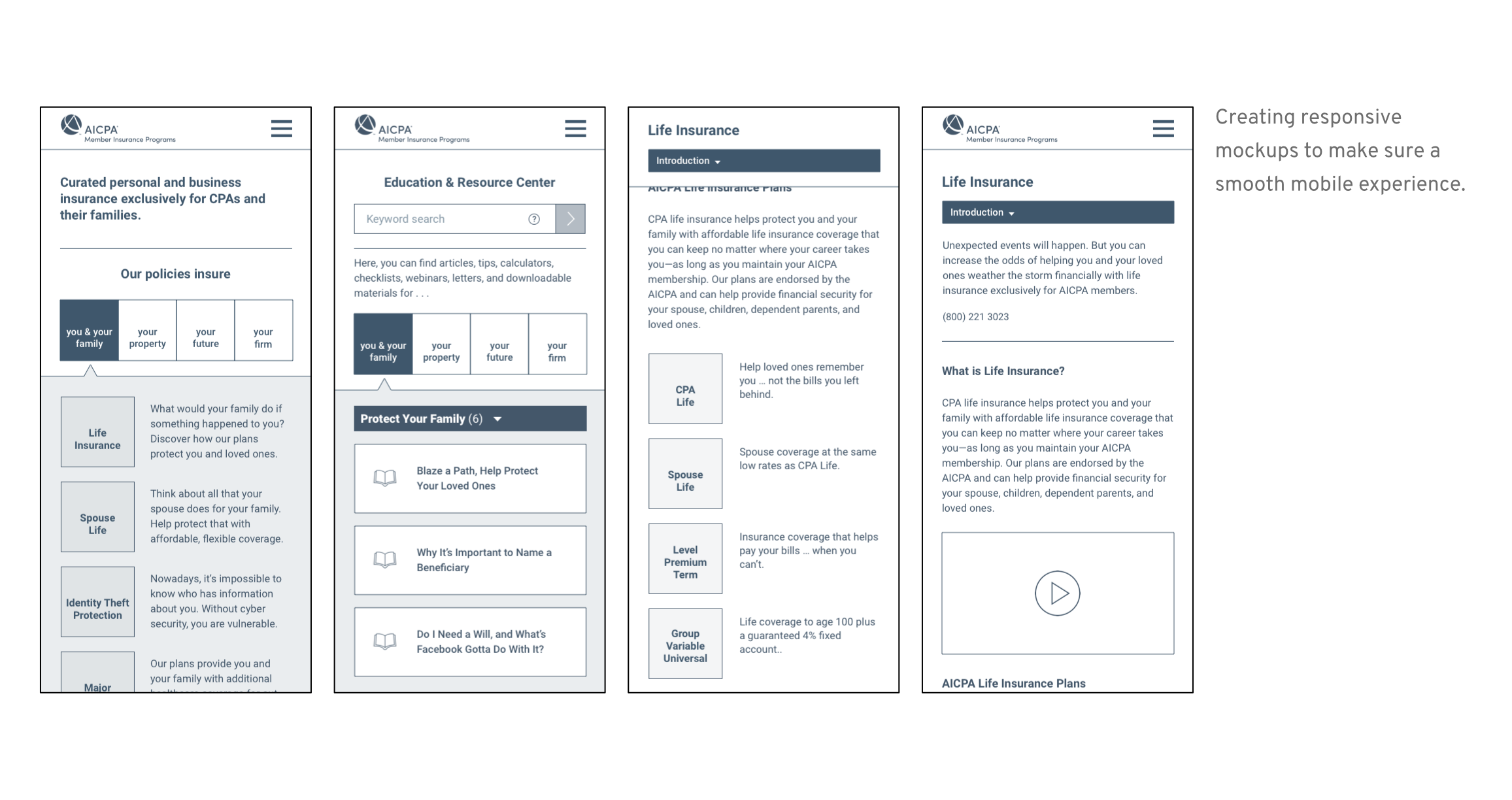
This is super helpful! By analyzing the data, we were able to not only identify what the main user group is, how they come to the site but also what devices they use. Because over 90% of traffic comes from the desktop device, we decided to prioritize desktop experience and put mobile responsiveness in mind when wireframing.
• • •
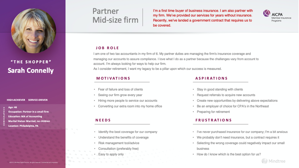
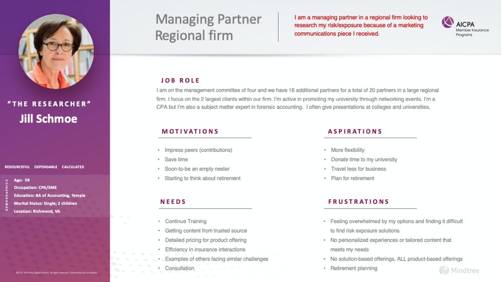
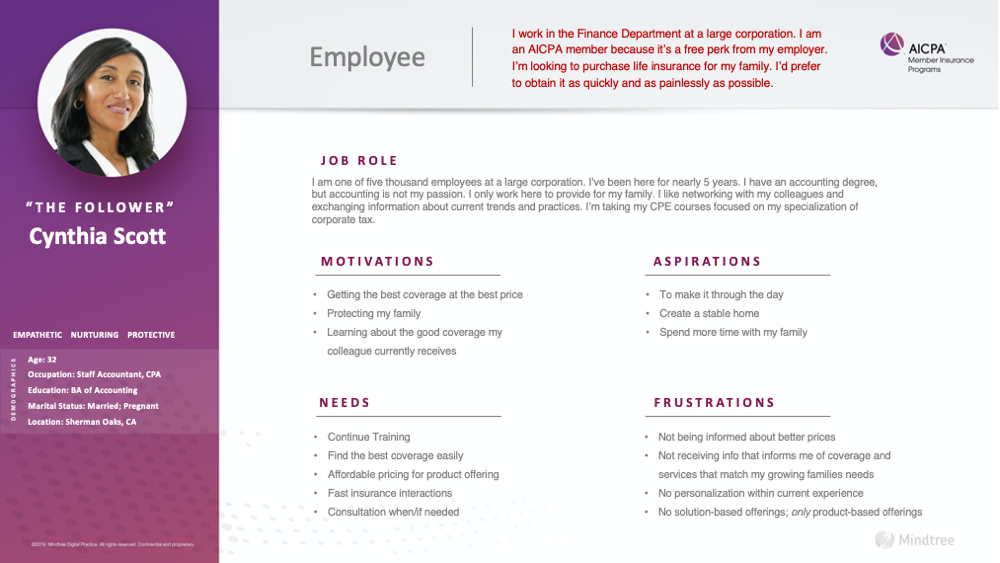
Creating Personas for 5 User Types_
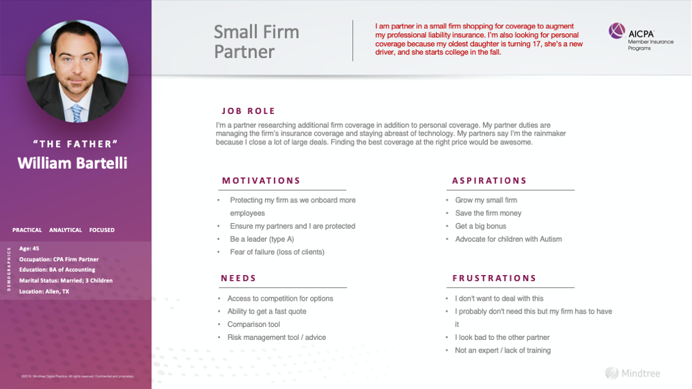
We grouped user stories into 5 major types and created a persona for each of them. Usually, a persona will include some personal information to make it look like a real human. However, for this project, since we were selling both life & business insurance products, we needed to be extra thorough while considering the personal attributes. For example, a person who wants to buy a professional liability product would potentially also need a personal life insurance product.
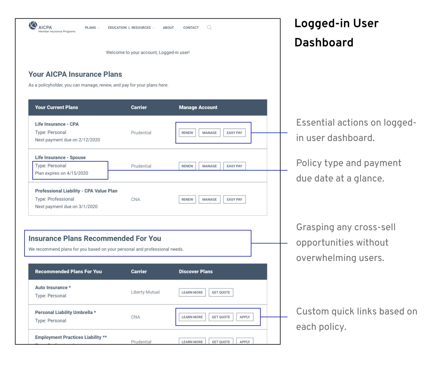
Therefore, in addition to major products on personas, any cross-sell opportunities needed to be considered as well.
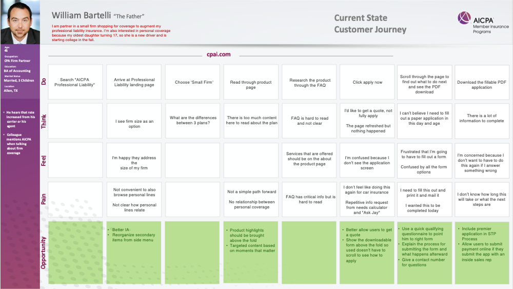
Identifying Opportunities Through Journey Mapping_
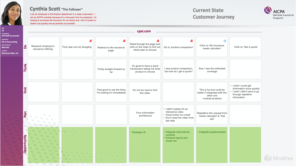
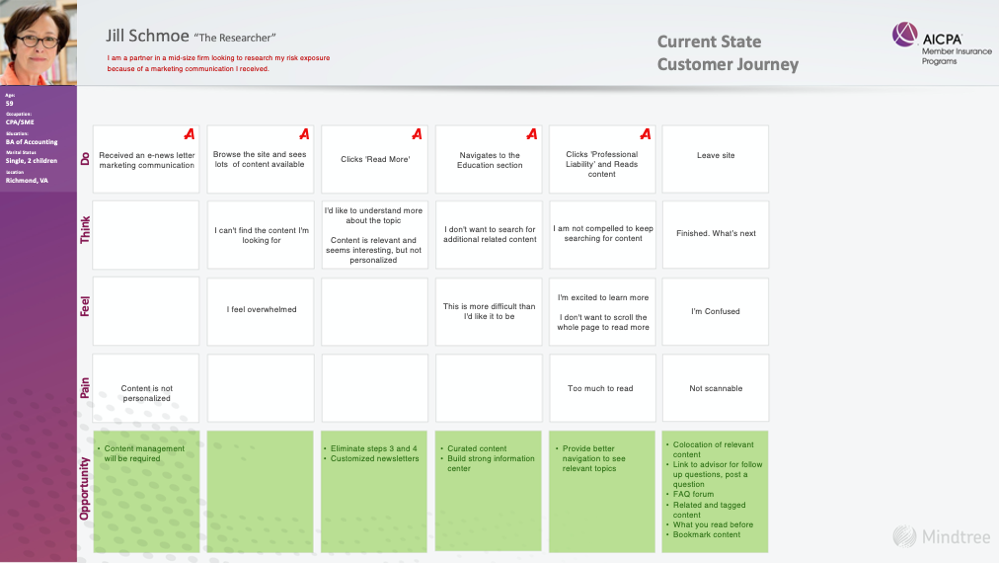
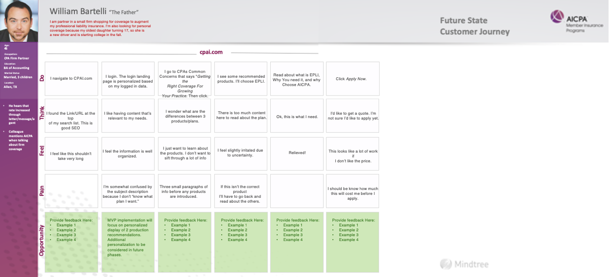
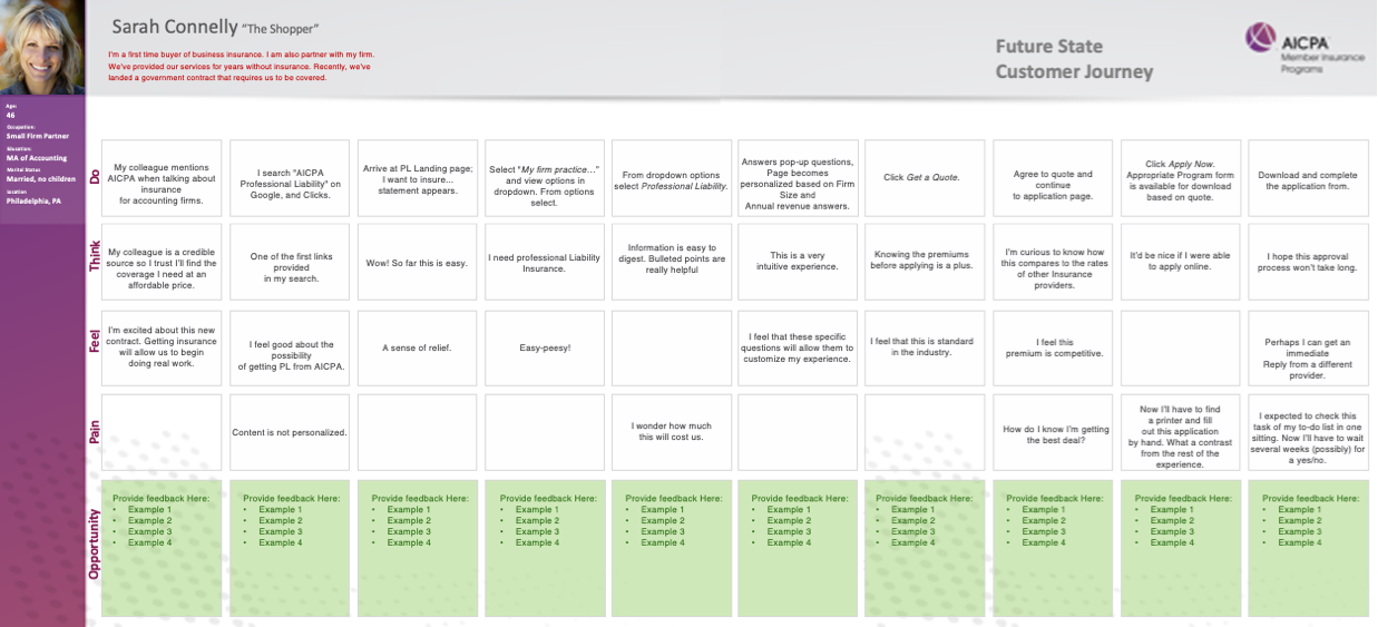
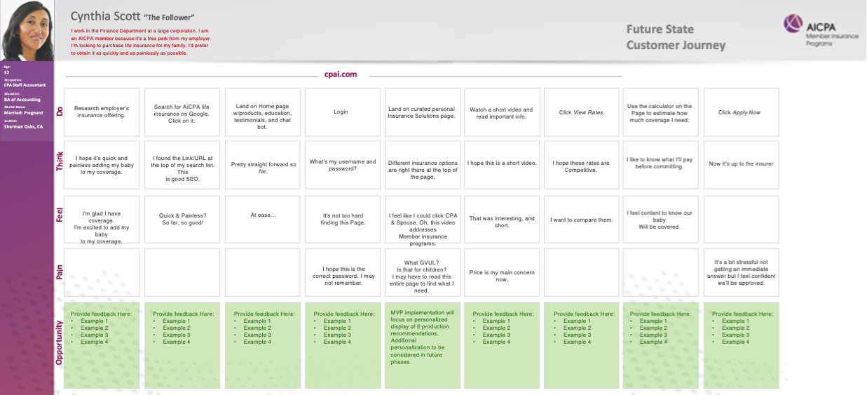
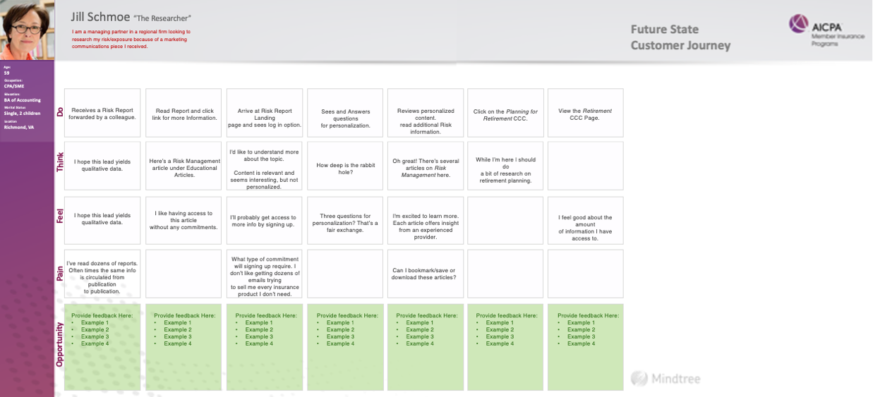
Using the personas, we simulated users’ behaviors and created journey maps to reflect them. On each journey map, we included 5 rows – Do, Think, Feel, Pain and Opportunity. With these five dimensions, we could address users’ pain needs in current state accurately and propose the solutions for the future state.
On each journey, the user would be a CPA, looking to either purchase or research about a product. We gave them different touchpoints – Newsletter, Google, and URL so we could reflect the research results and improve the user experience from different perspectives comprehensively.
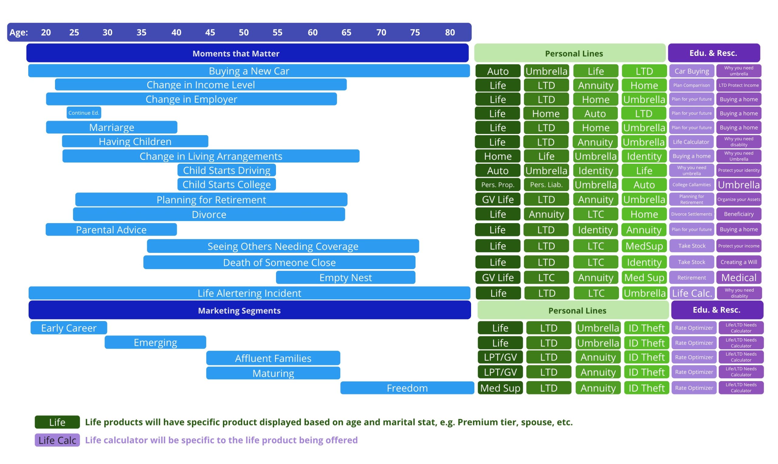
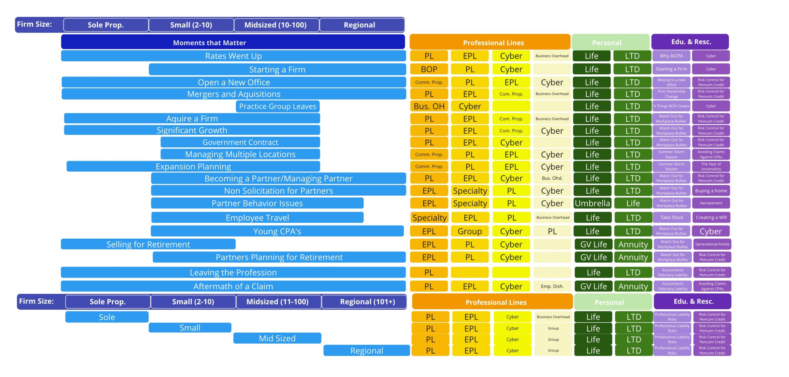
Constructing Personalization Strategy Workflow_
One of the big challenges was how we could help CPAs quickly find the product they need. Because of the complex information architecture of this website (selling over 30 insurance products), new users usually needed to go through a bunch of pages to learn what product is the one they need. Although some users may already know the specific product, they still need to read poorly-organized text on the product landing page before deciding to purchase.
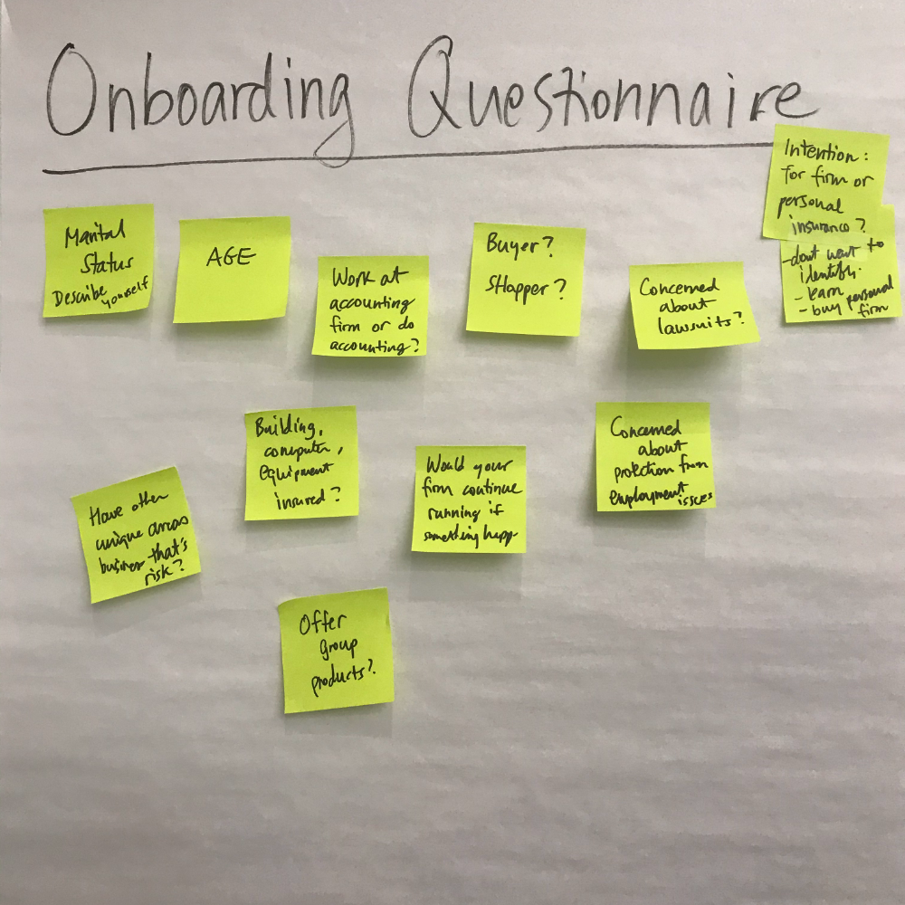
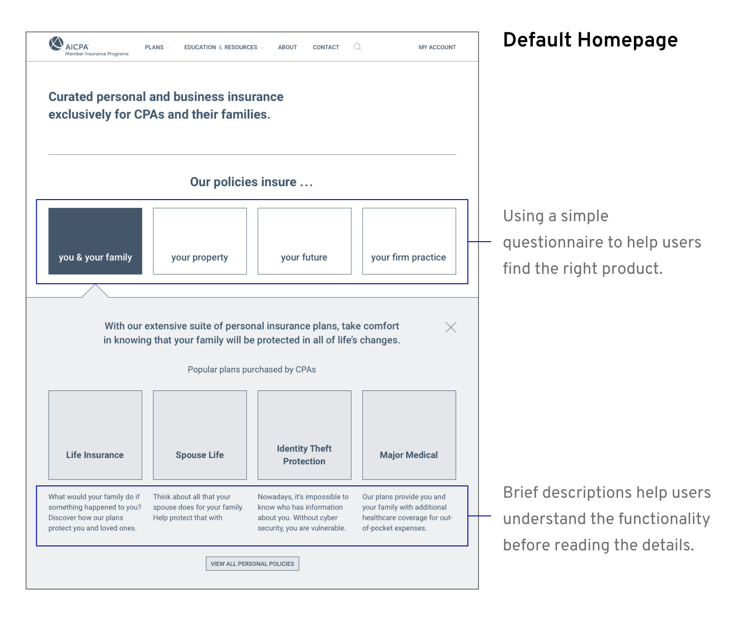
Since we always needed to sell personal business and personal products and every product has different features, we started to explore the content personalization strategy through the next couple workshops.
The goal of personalization was to guide users to the products that match their potential need. For example, if a CPA’s college kid is buying a new car, they might want to buy a new car insurance for the kid; or if a sole CPA firm partner is expanding their business, they might need a professional liability policy.
Future State Journey Maps
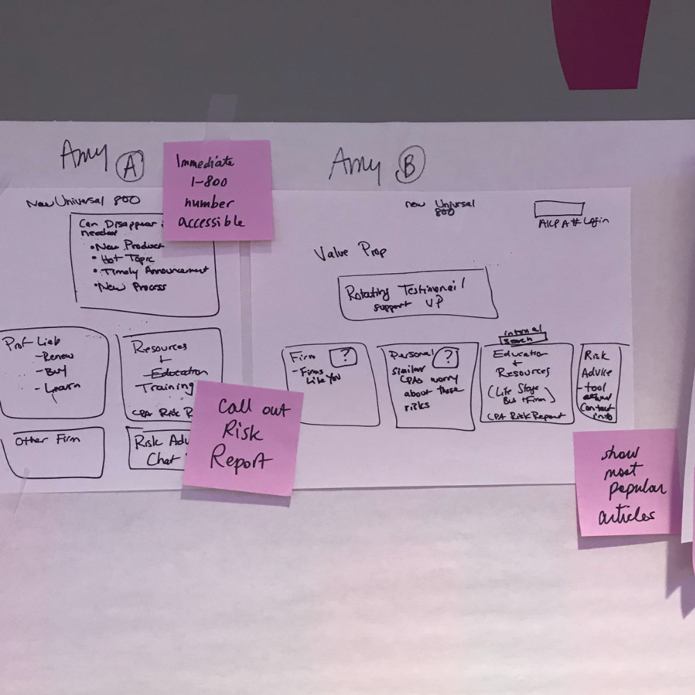
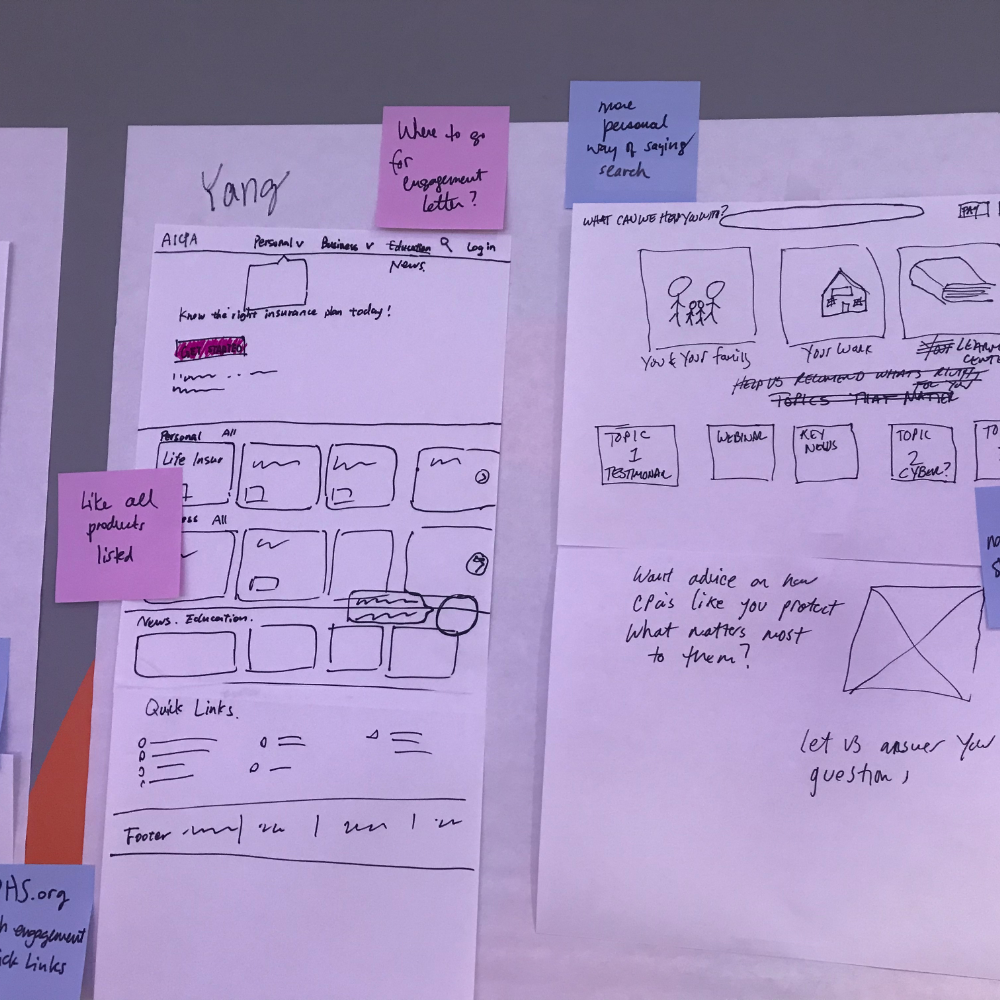
Ideating Website Layout_
Through out the last few workshops, we spent time ideating website layout on paper based on the content needed. We selected valuable parts to use for the first version wireframes.
• • •
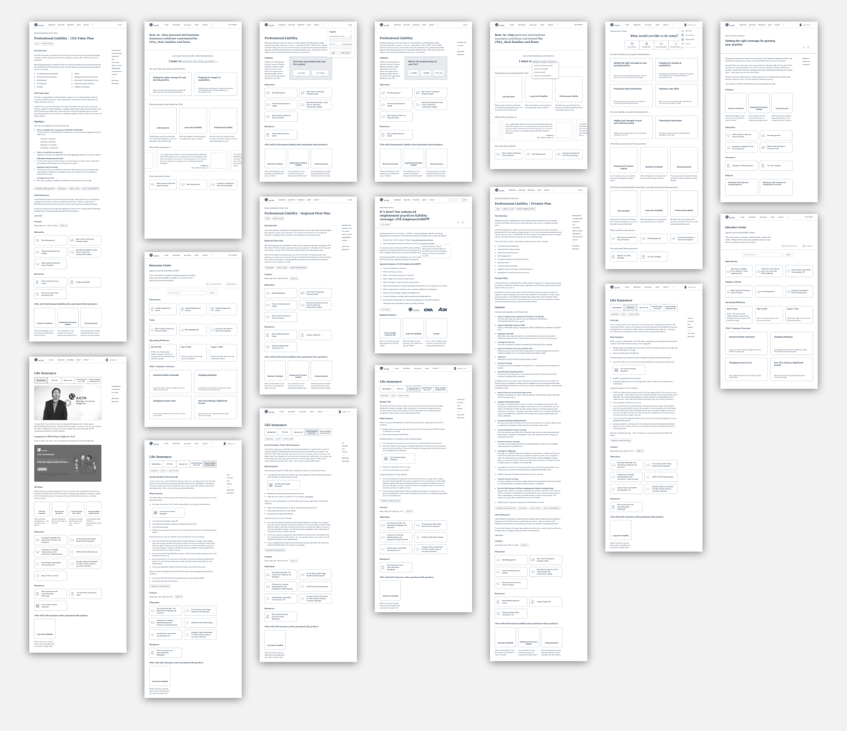
Creating Testing-ready Lo-fi Wireframes_
Based on the ideated layouts, personalization and future state journey maps, we started creating wireframes. We used Sketch to wireframe and InVision for user testing.
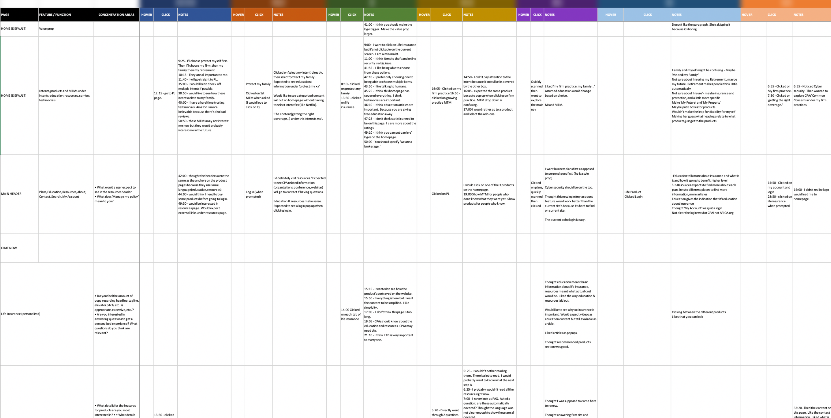
Testing with 14 Users & Analyzing Their Feedback_
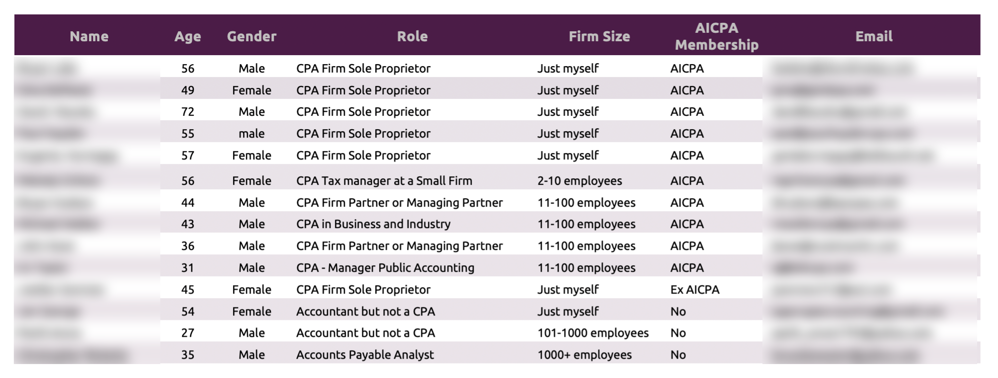
We sent a user testing recruitment questionnaire on Craigslist and received over 100 responses. After carefully selecting, we chose 14 users to conduct user testing with. When selecting participants, we wanted their profiles to match the personas as much as possible.
User Testing Participants
User Testing Analysis
• • •
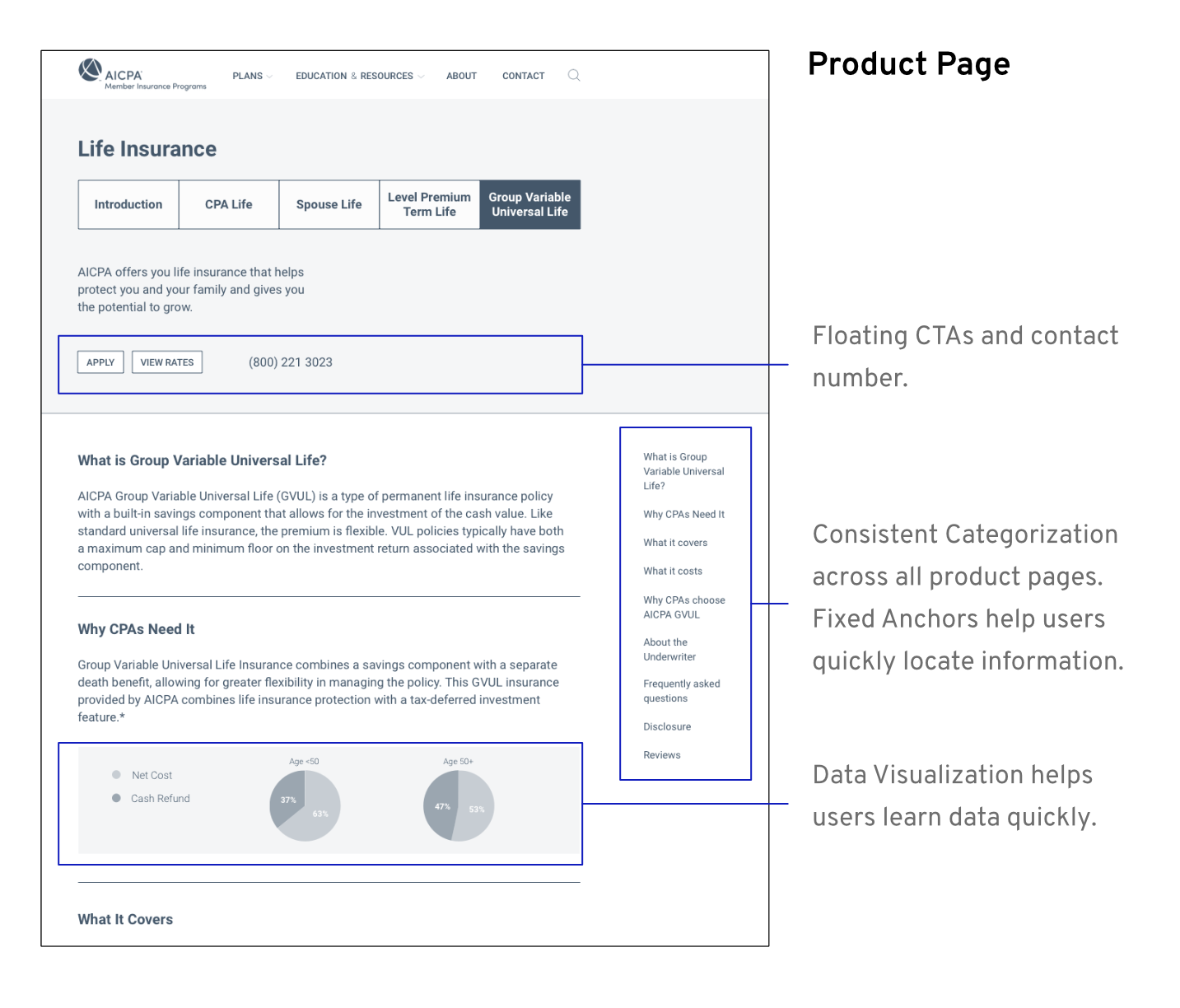
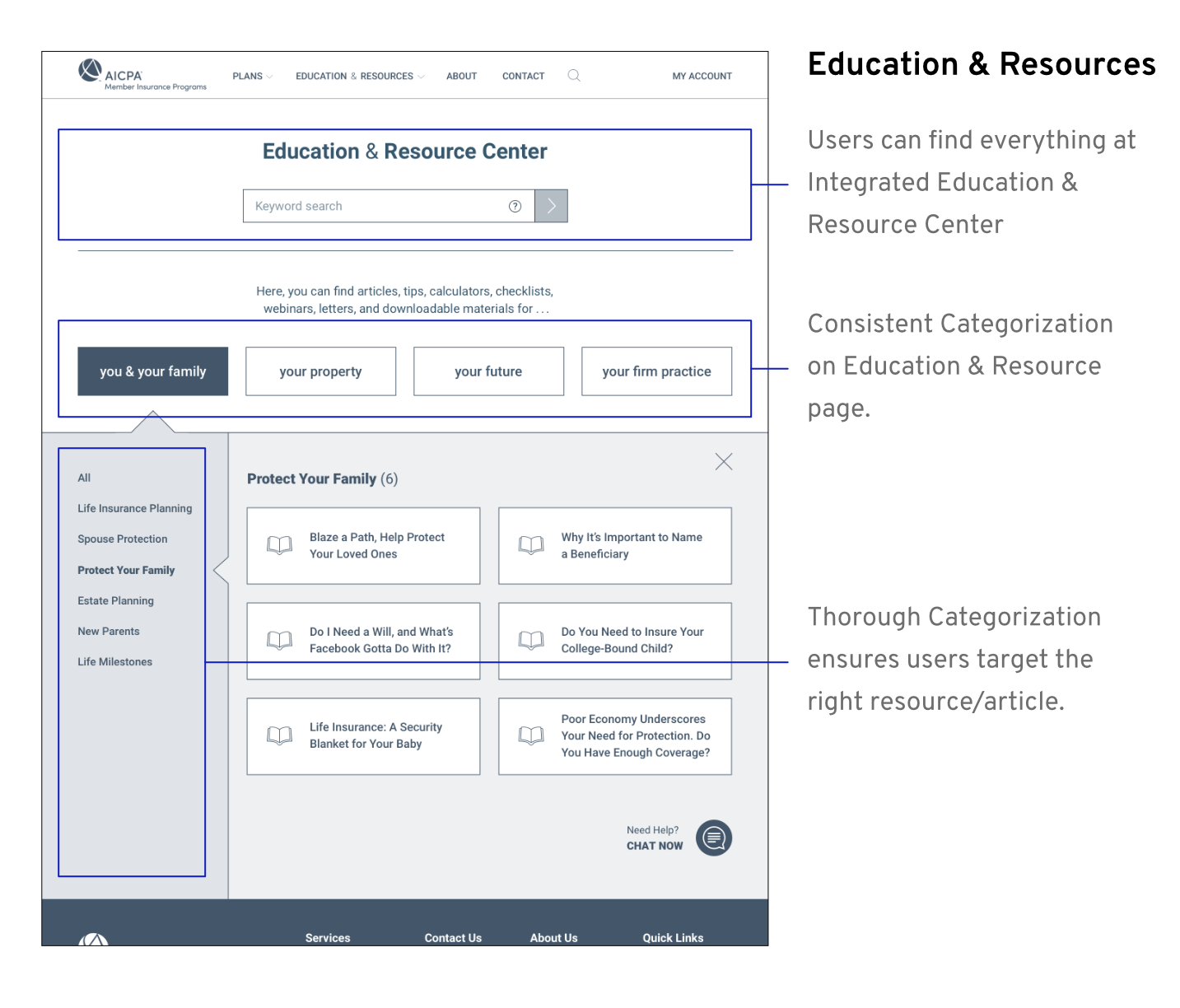
Iterating Wireframes & Finalizing Interative Prototype_
We kept iterating the wireframes as the user testing went along. By the last user test, the user was very satisfied with the prototype.

Experimenting Visual Design & Illustration Styles_
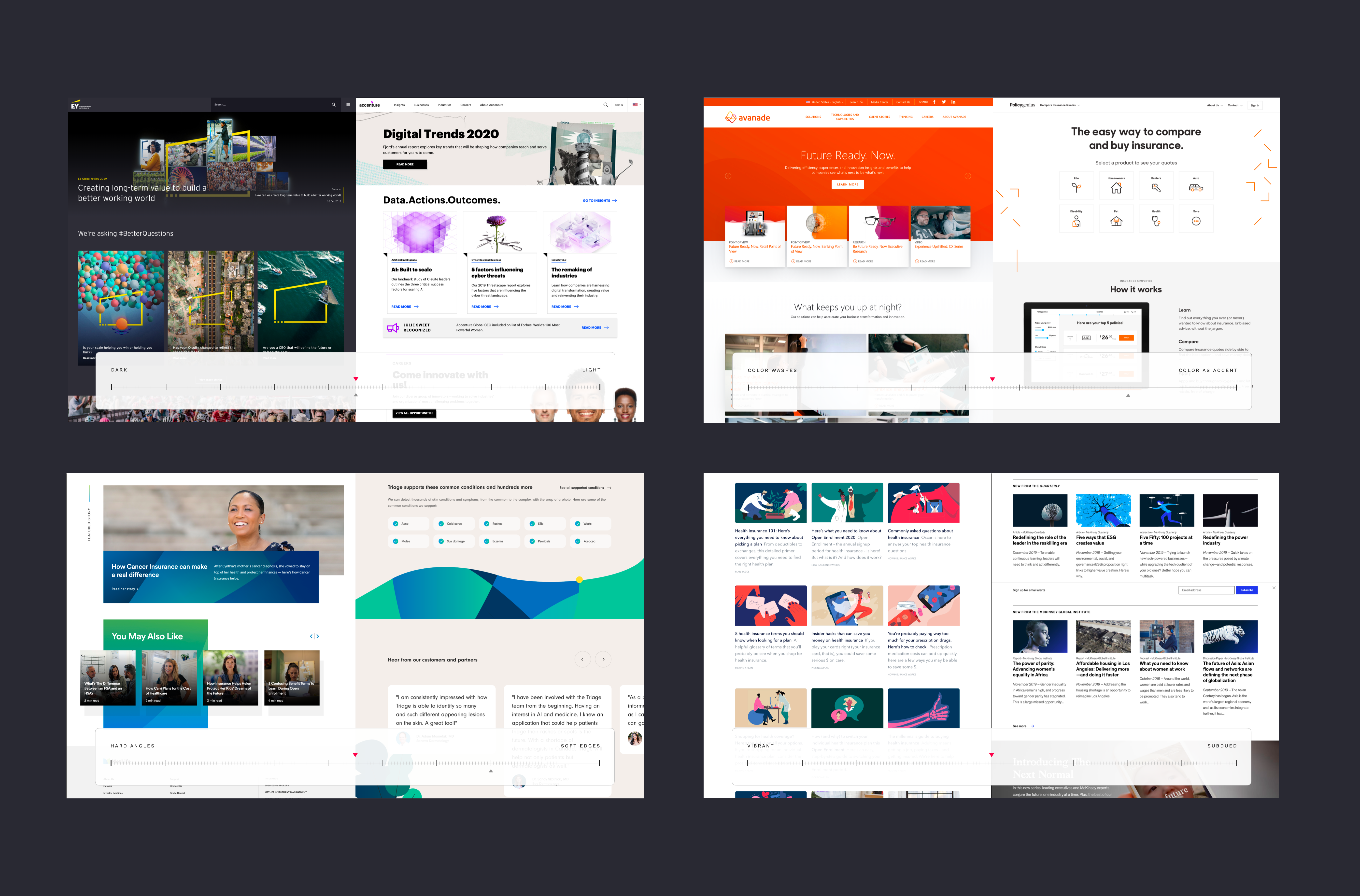
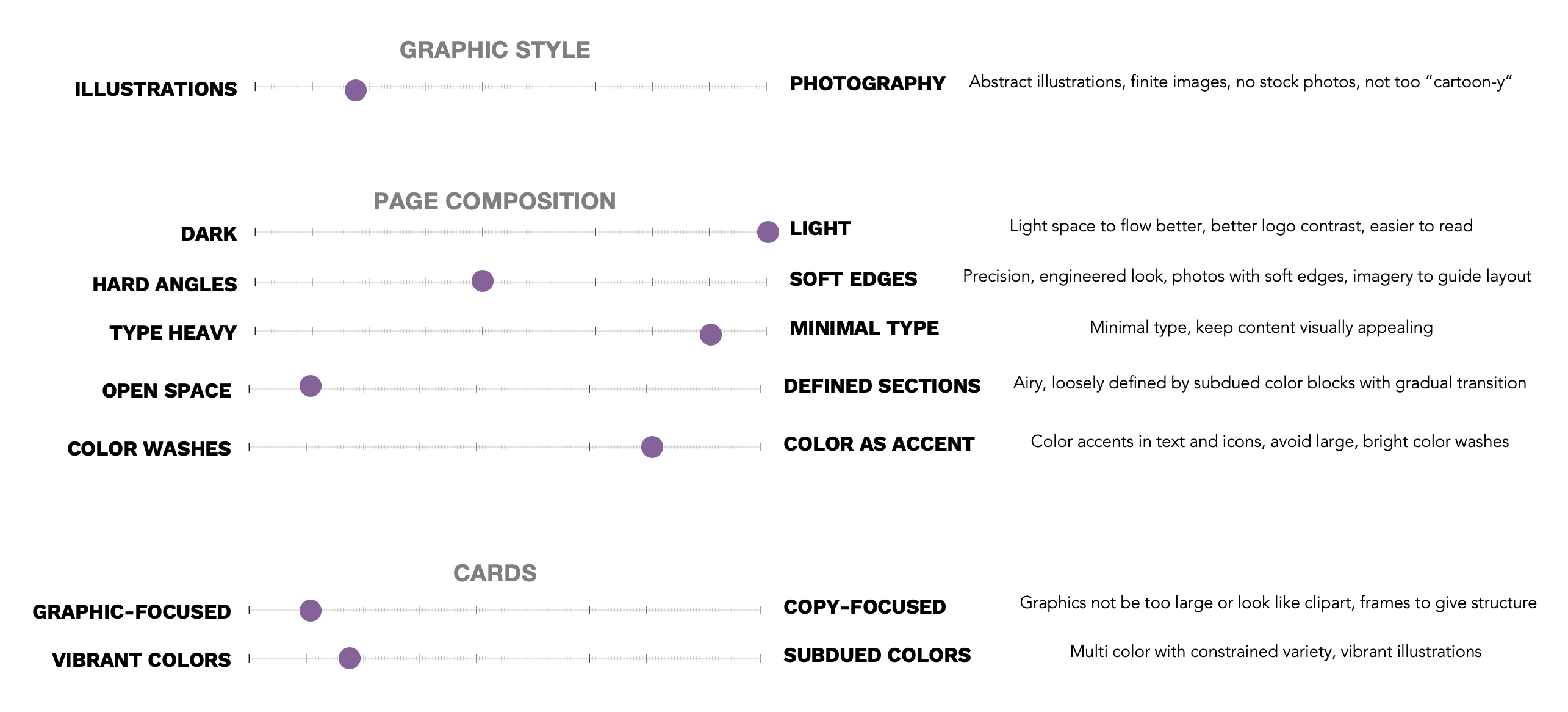
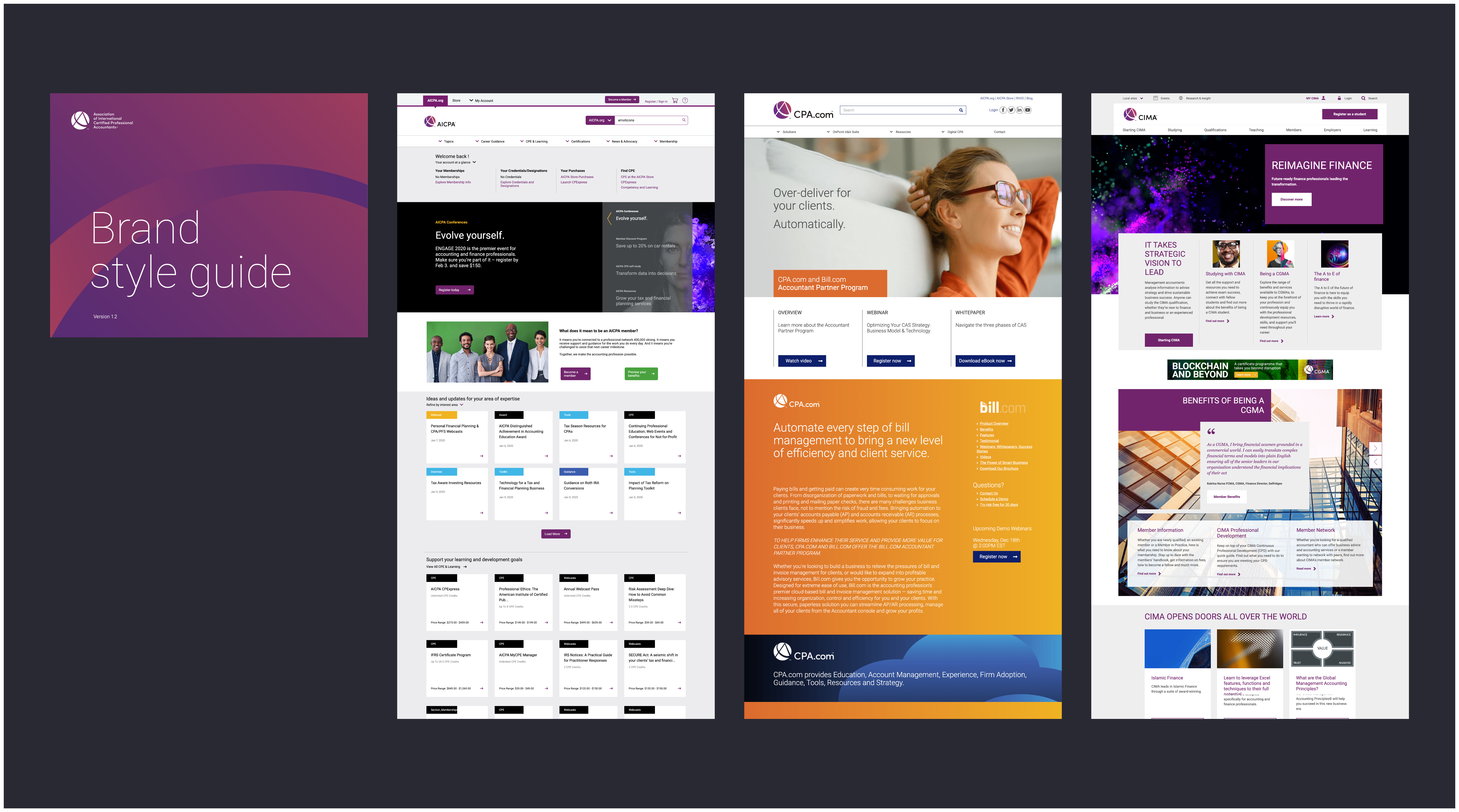
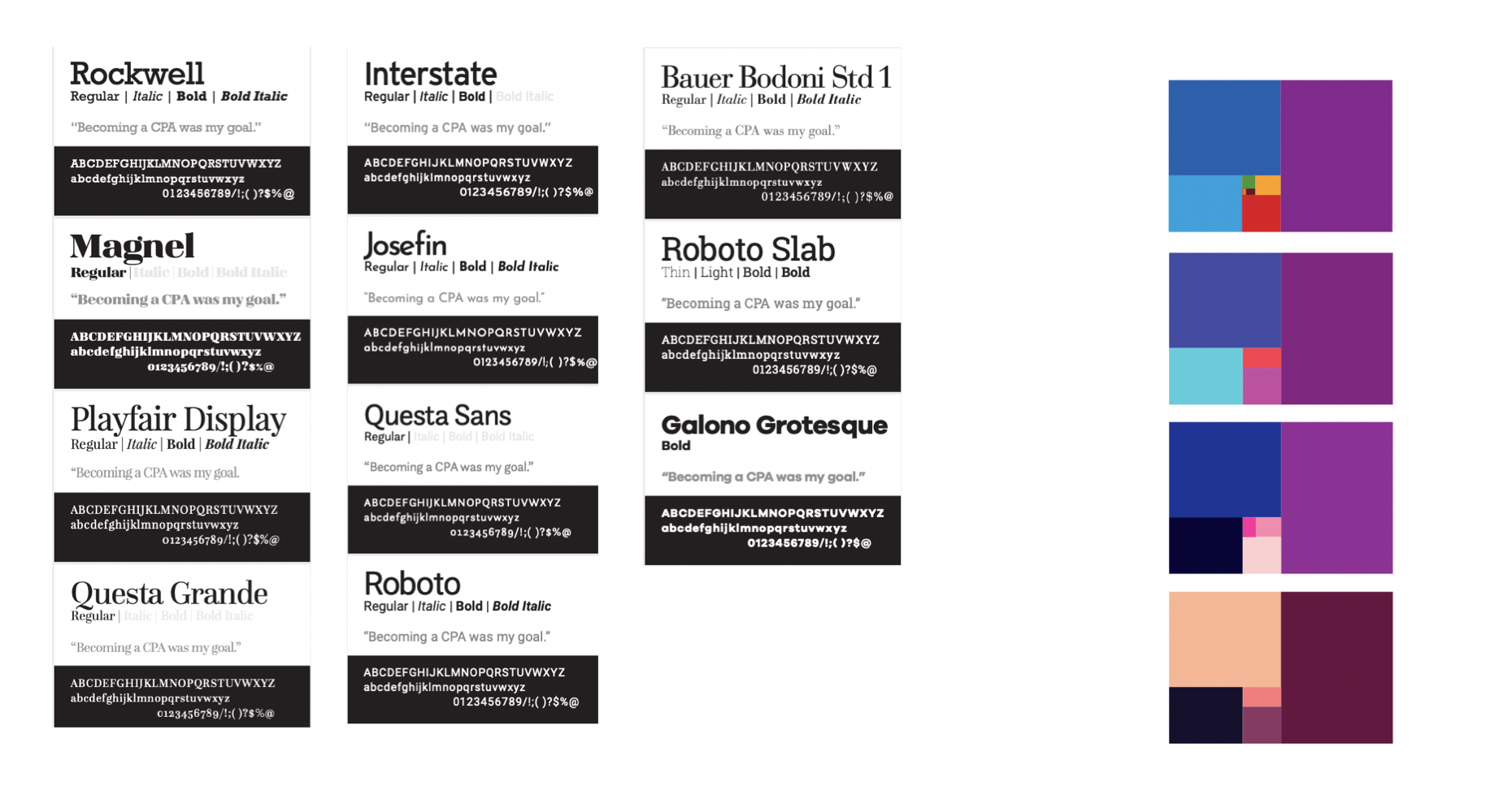
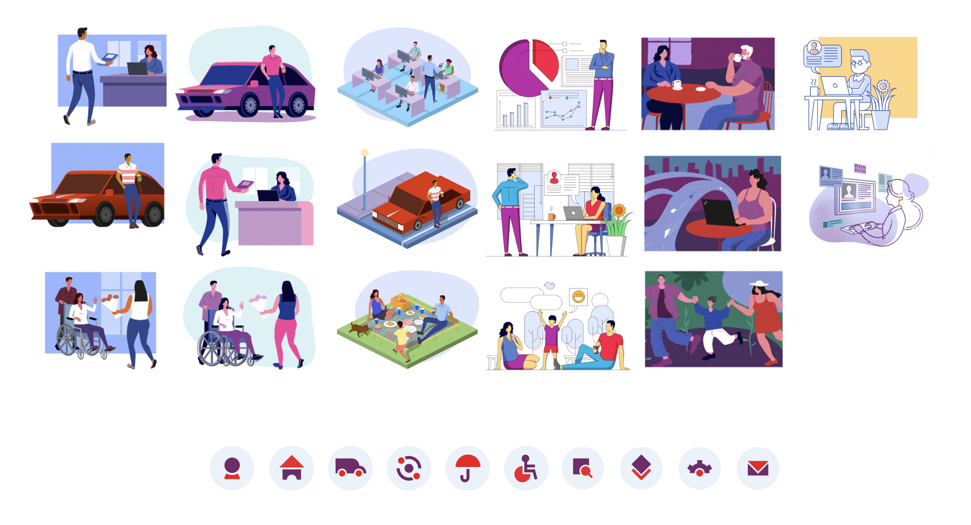
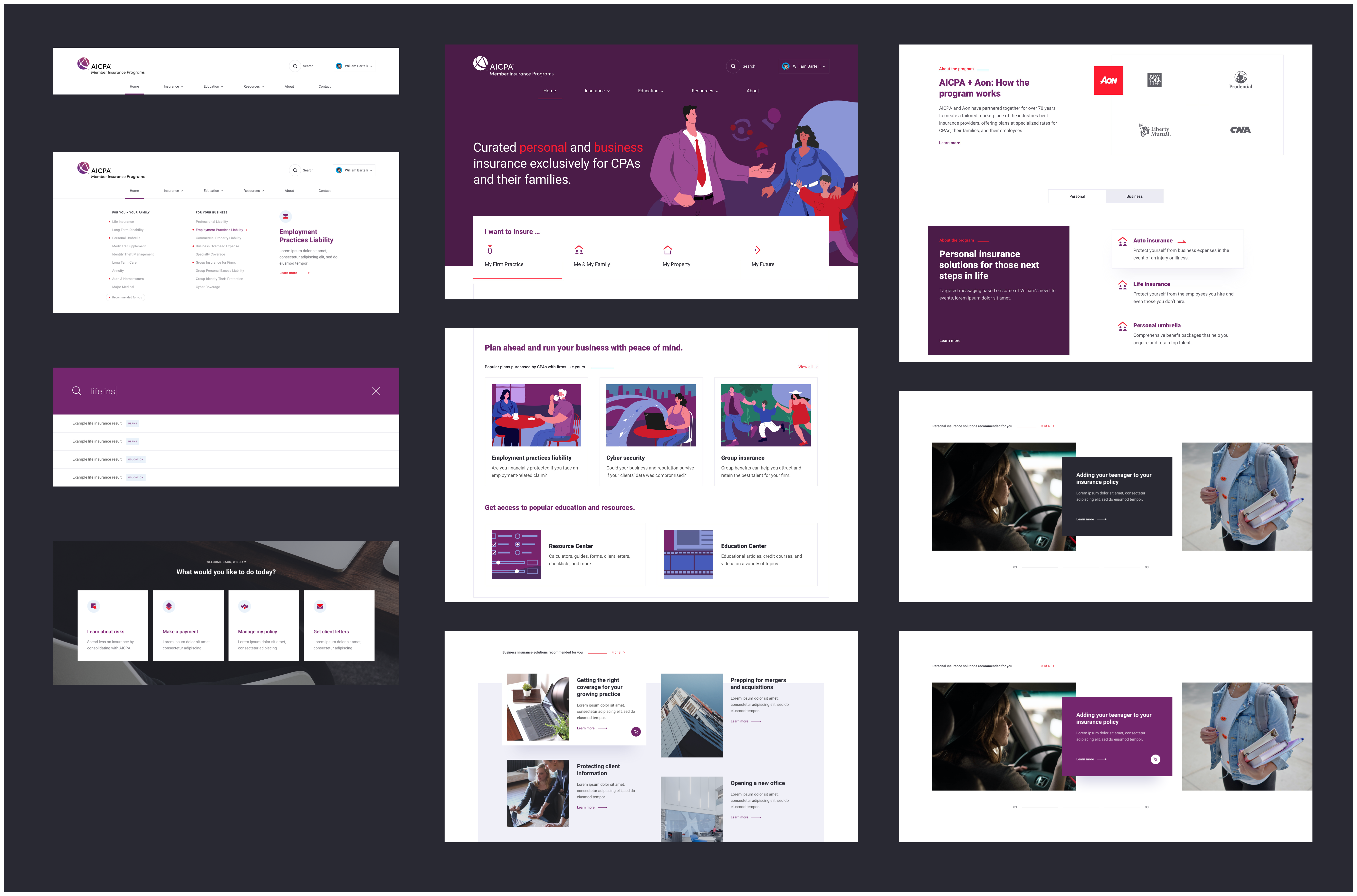
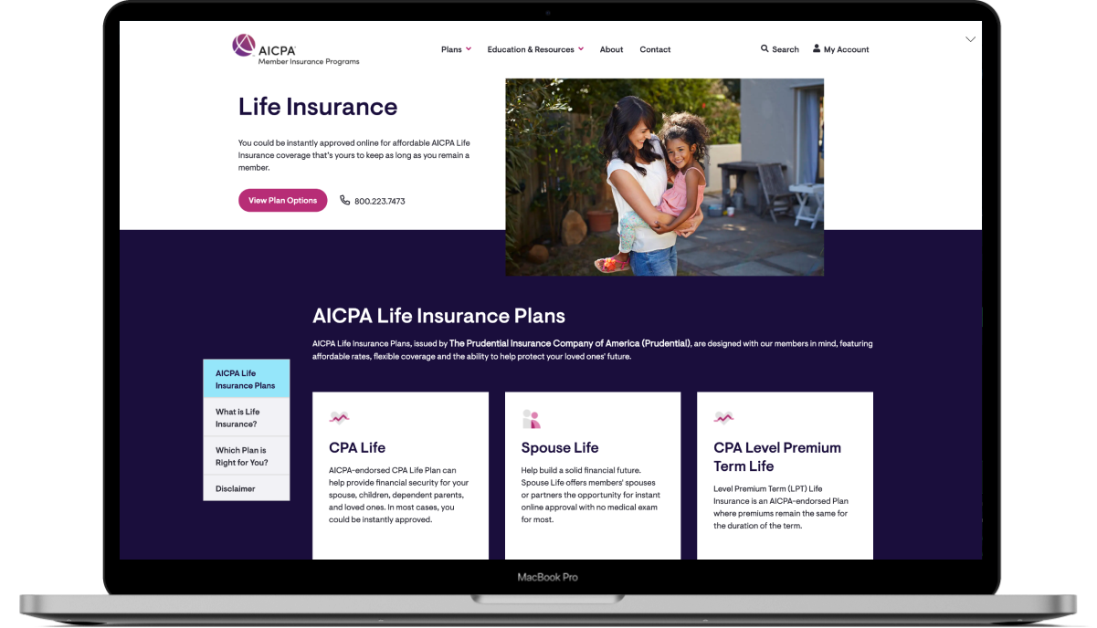
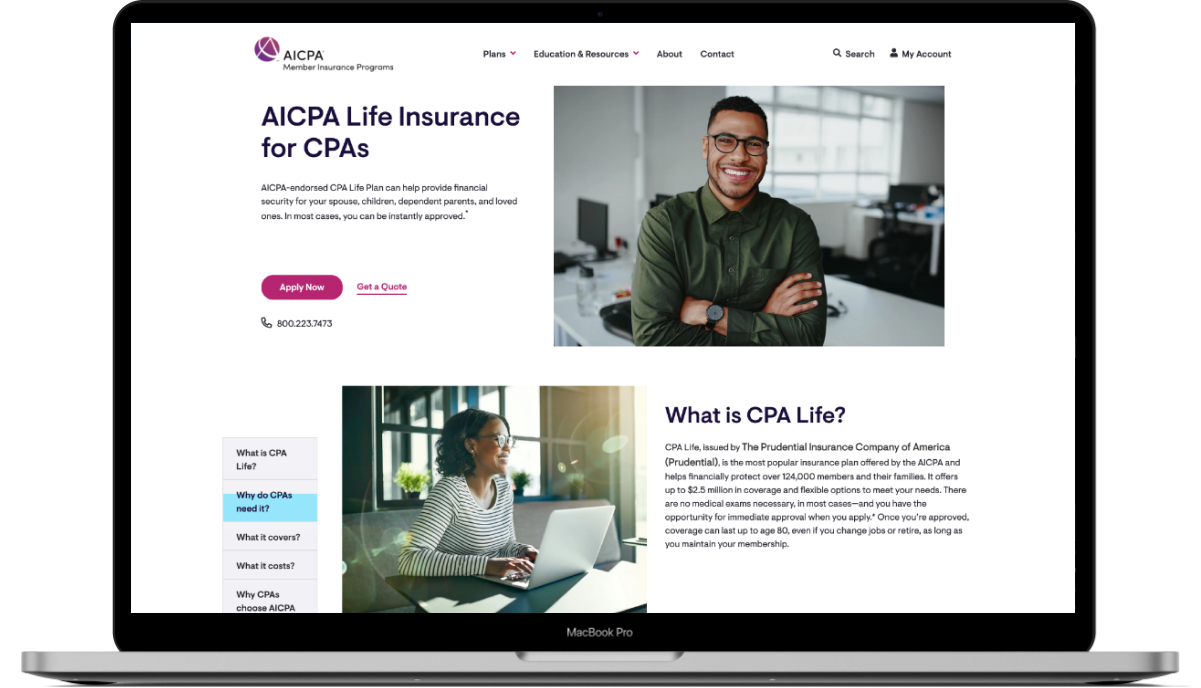
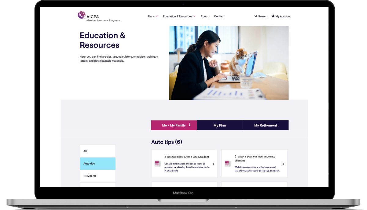
As the visual designer and illustrator on the team, I spent much time putting together a visual design mood board and let stakeholders choose their preference. I also created original illustrations and icons. However, since visual design is relatively more subjective, we were not able to land on a specific direction at the current stage. That’s said, we will keep exploring in the future stages.
Stakeholders’ Preferences on Visual Design
AICPA Brand Style Guide & Other Affiliated Websites
Font Treatments & Color Palettes
Illustration Exploration
Component Exploration
• • •
Getting Validated by Clients & Moving on to the Next Step_
After further review by the stakeholders, it was confirmed that the team’s proposed information architecture, wireframes and visual design direction fulfilled the team’s requirements very well. Then, we coordinated with their internal design and development team to expand the existing design. The live site was launched in 2020.
OTHER PROJECTS


