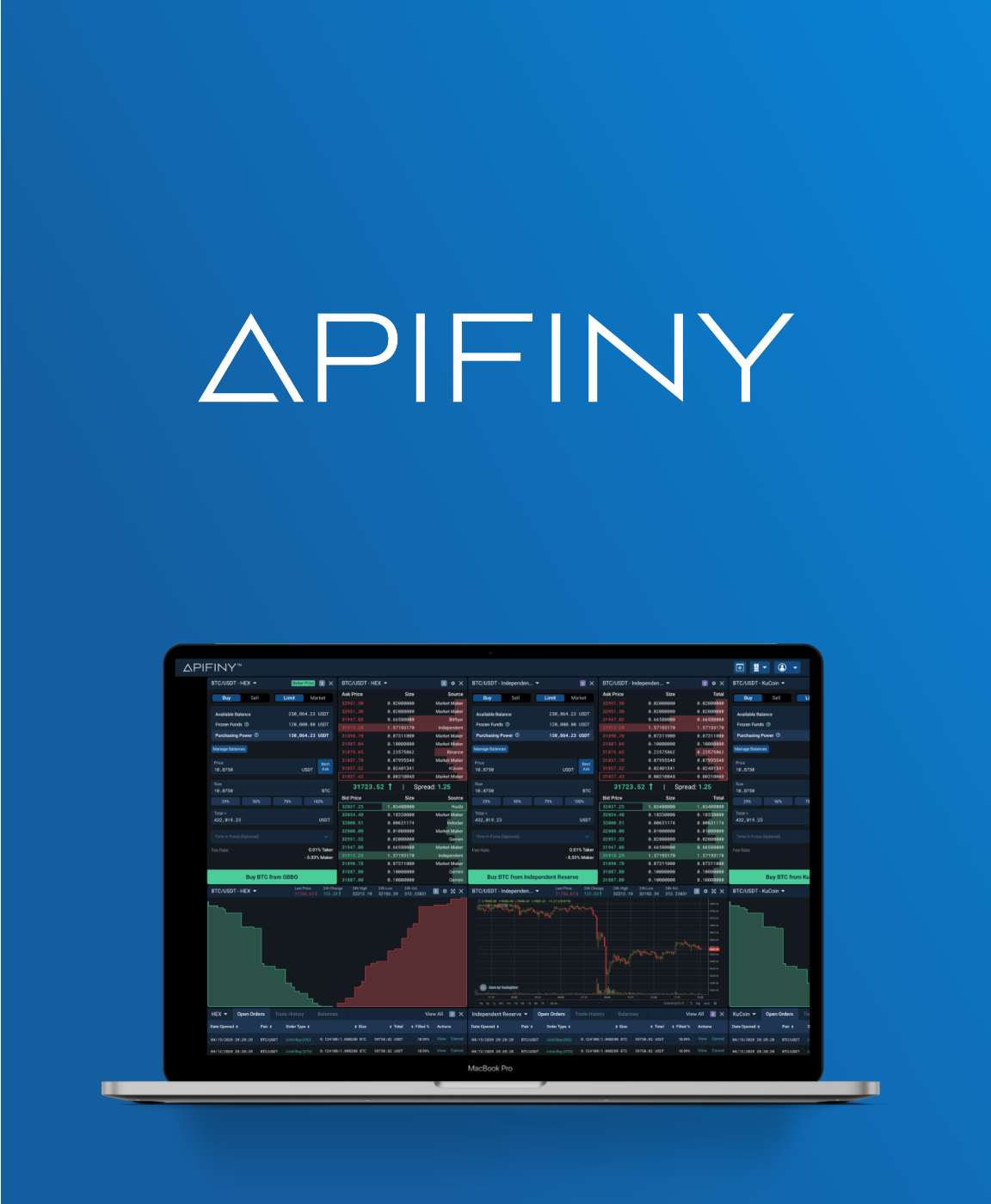
Apifiny Crypto Trading Platform
My Role
Lead UX/UI Designer
Duration
8 Months
Overview
There are so many crypto trading exchanges in the world. Each of them has different prices and supports different tokens. As a trader, it’d be ideal to have a trading product where they can see the prices all over the globe and to be able to trade directly on it. It’d be even better to be able to trade directly on that platform. And that is where Apifiny comes in.
Apifiny is composed of 2 products – Apifiny Connect(AC) & Hybrid Exchange(HEX). AC is a unified trading platform where traders can trade crypto globally on over 25 exchanges. On the other hand, HEX applies automatic market-making strategies to get best prices from the 25 exchanges. The following diagram gives a straightforward explanation of how 2 products work.

Mission Statement
Apifiny’s first trading dashboard looked very similar to other exchanges – it only supported USDT/BTC trading and wasn’t connected to other exchanges yet. However, the design can’t support the increasing features and requirements anymore. Developers were able to add a couple of fields as a temporary solution but the UX would be a huge problem in the long run. Therefore, I started this design/redesign project.
First of all, I wrote down all the key features.

Customer Feedback & Journey Mapping
I collected some valuable feedback from our existing customers through our sales team. The feedback was helpful enough for me to put together a current state journey map.


Usability Critique
Based on the customer feedback and stakeholder requirements, I evaluated the UX of the current design.


Design: Trading Page
After the current UX analysis, I started getting into the design.
Since the trading page and the admin portal are relatively very different from each other. I’d like to go through them separately.
It took me at least 3 key iterations to settle with the current design. My design thinking flow can be demonstrated with the evolution of the 3 iterations.


Design: Admin Portal
Although not as visible as the front-end trading page, the admin portal carries lots of important functionalities that support the front-end.
Lots of functionalities on the admin portal were designed through other projects. Here I’m emphasize the features that are closely related to the trading dashboard.


Design System
When doing this project, I also decided to create a UI library so the basic elements could be reused in the long run. To create the design system, I went back and forth with stakeholders to settle down with a visual style and expanded from that.

Interactive Prototype
With all the design components, I created the interactive prototype for review & developers’ reference.
UX vs. Technical Feasibility
Technical barriers always hurt me as a UX designer but they do exist. After finishing the design, I needed to evaluate each of them and decide what design could be compromised and what couldn’t.
Here is a very good example of how I learned that sometimes the good UX is worth taking more time.

Traders can use this pop-up to select a trading pair and one of its supported exchanges. It provides a comprehensive view on the price and fee differences between exchanges.
However, the dev team would have to spend almost too much time to build this which they were not expected to. So they asked me to design a compromised version that’s easier to build. I was wrong not to insist on the original design and made a simplified version just to save the development time – it got horrible customer feedback. I had to go back to the dev team and tell them we have to build the full version. We ended up spending more time.
Next Steps
I’ve been helping the dev team find UI issues and pushing them to better implement the design system. Looking back, it’s hard to believe how much we’ve done in only a year.
For a startup, quick iterations are always the key.There are always new features coming up and the dev team still needs to fix the existing front-end issues. Therefore, it’s very important for a designer to think about the upcoming features ahead. I’d have spent less time if the initial design was more thoughtful. I really value the lessons I learned by doing this project and I’m pretty sure designing new features will be much easier with all the infrastructure we’ve built.

OTHER PROJECTS