UpSurge
MY ROLE
Visual Designer
Illustrator
DURATION
3 weeks
INTRODUCTION
This is the infographic I created for Upsurge’s homepage. I collaborated with a motion designer who made my illustration move and a web developer who implemented the graphics on the web.
VISUAL DESIGN
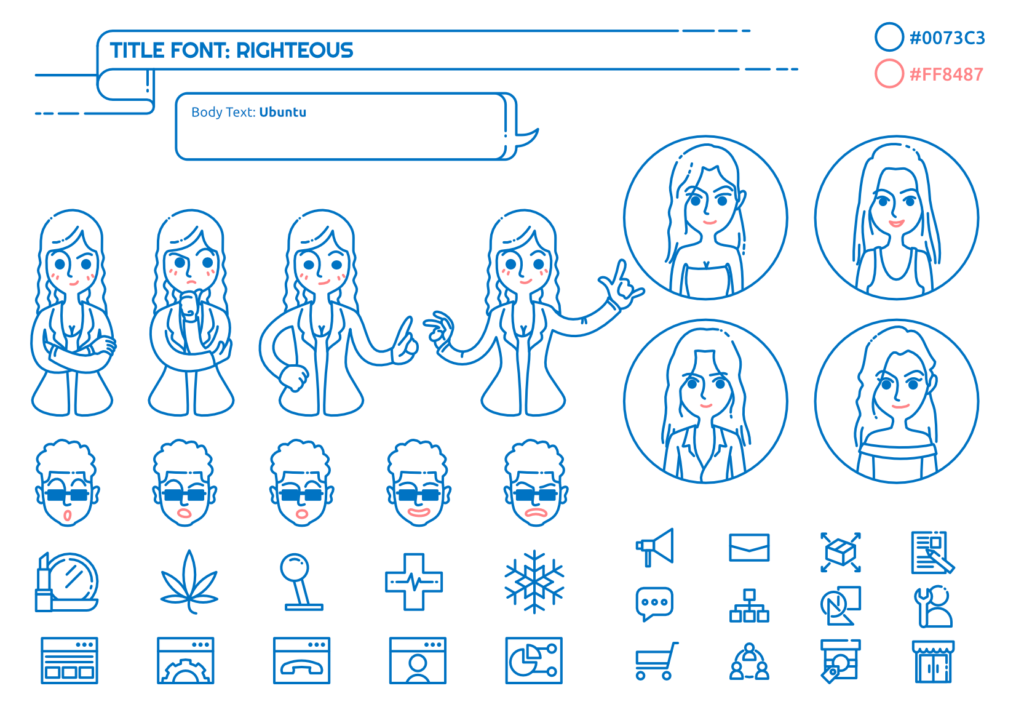
Before starting to draw, I needed to define the visual identity. I decided only to use one primary color and one secondery color to make the presentation clear and modern. Simple color palattes are also good to make all elements look consistent and build hierarchy between items. Also, I used linear illustrations everywhere to make the canvas look complex.
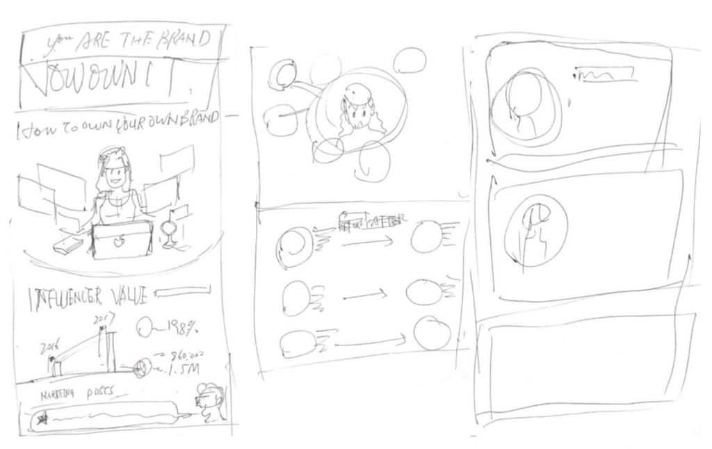
I sketched roughly on the paper to help me think about the workflow.
Through illustrating, I manually created every small object including a bunch of icons and characters because I wanted the graphics to be 100% visually consistent.
Please feel free to check the live website out or see the flat image below!
This is an ongoing project. The website may be not finished.


