Pratt Institute Libraries
MY ROLE
UX Researcher
Visual Designer
DURATION
3 Months
OVERVIEW
Pratt Institutes has libraries on both campuses. As a UX design candidate at School of Information at Pratt, I was involved in the project of the library user experience redesign. Including me, there were 15 people working together. We were divided into small groups for different research and design tasks. Our goal was to improve both physical and digital experience of Pratt libraries. After 3 months of research and design, we presented the proposals including the prototypes of the new library website design and a mobile companion app for in-library use to the stakeholders – the librarians of Pratt Institute Libraries.
LIBRARIES’ MISSION
We had a meeting with the librarians at the beginning of the project to find the problems of the current library and the mission they want to complete. During the meeting, we interviewed the librarians with questions from five perspectives:
- Organizational context
- Desire, viable, feasible criteria
- Current state of things
- Competitors & influencers (external)
- Users/customers
We did the interviews separately with the librarians. After the interview, we put the notes together to find out the target users, pain points and any constraints based on the interview results. Generally, the mission could be summarized as these 2 below:
-
Supporting the research needs of Pratt students and faculty.
-
Updating the website to improve and streamline access to library resources and services.
RESEARCH PLAN
After the interview, we made the plan for the next step research. Basically, the research focus is summarized as these directions below:
- Users’ expectations, perceptions, likes/dislikes, and level of awareness of the library and services
- Services that are used the most and the manner in which they are used
- Information architecture of the website
- Experience in the library space
According to the directions, the research process was divided into 4 parts regarding the professional UX research methodologies:
- Literature Review
- Competitive Analysis
- Interview & Survey
- Observation
OBSERVATIONS
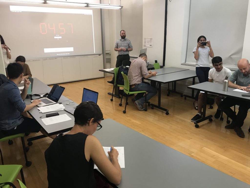
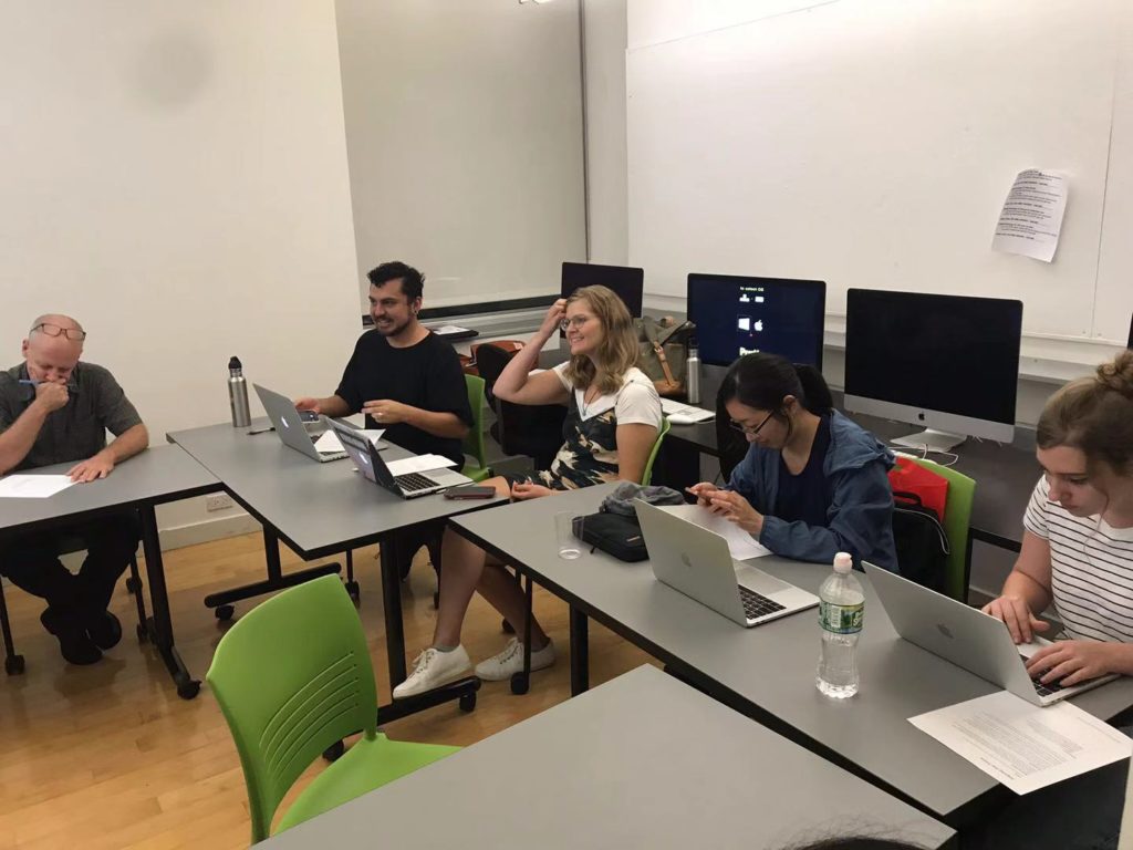
I decided to focus on the observation part. With other 2 researchers, we made the plan for space observations on both Brooklyn and Manhattan Campuses, and 6 task observations on the current library website.
SPACE OBSERVATIONS
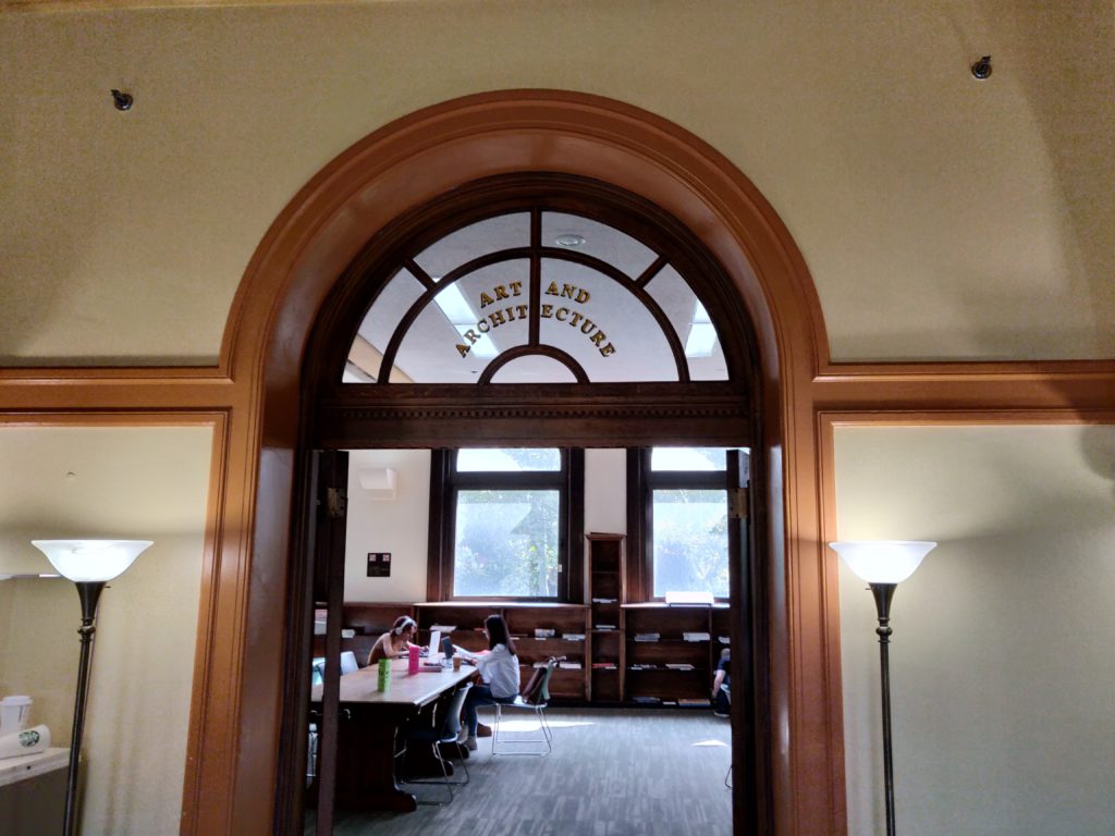
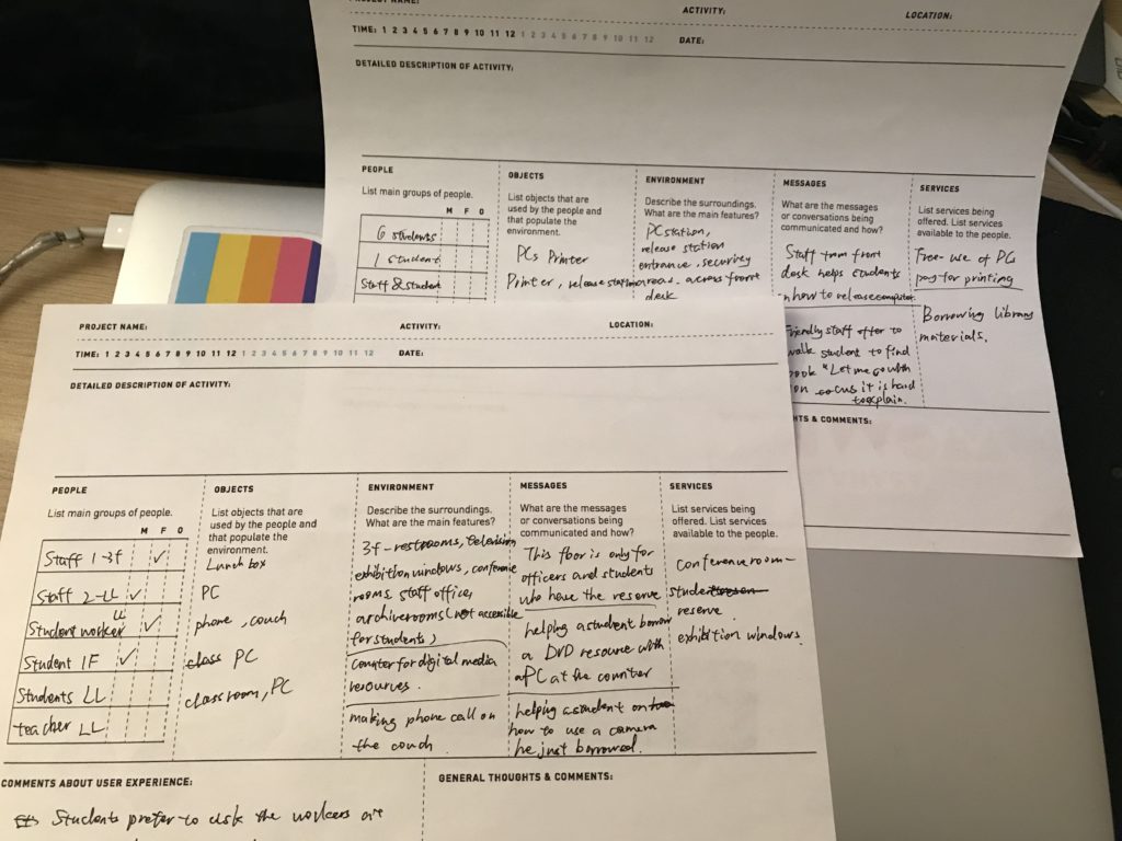
For the space observation, we used the POEMS. POEMS let us observe the physical space from 5 perspectives – People, Objects, Environment, Messages, and Services. There are 4 floors at Brooklyn library and 1 floor at Manhattan Campus. We spent 15 minutes walking around and observing on each floor and used the POEMS sheet to take notes and put everyone’s insights together.
TASK OBSERVATIONS
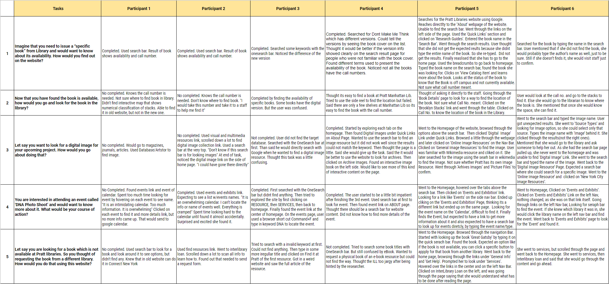
For the website, we used the classic observation method. We came up with 5 tasks based on the users’ most frequent activities on the library website:
- Imagine that you need to issue a “specific book” from Library and would want to know about its availability. How would you find out on the website?
- Now that you have found the book is available, how would you go and look for the book in the library?
- Let say you want to look for a digital image for your upcoming project. How would you go about doing that?
- You are interested in attending an event called ‘DNA Photo Shoot’ and would want to know more about it. What would be your course of action?
- Let say you are looking for a book which is not available at Pratt libraries. So you thought of requesting the book from a different library. How would you do that using this website?
We went to both libraries in person and asked the users from different programs and grades to do the tasks. During the observation, users were free to talk and ask any questions. 6 task observations were conducted in total.
OBSERVATION FINDINGS
Then, we used realtimeboard to sort and summarize the findings we found individually from the space observations. The online affinity map helped us quickly put the post-its into groups.
After putting every detail together, we summarized the findings into 5 key findings for physical space.

GENERAL WAYFINDING
- Students can’t easily navigate through the library space due to lack of a good wayfinding system.
- Poor services signage (i.e. Bathrooms, Archive Room).
- Displays, Exhibitions and Services offered on 3rd Level and Lower Level seen not be used frequently.
- Exhibition books have their own floor. These are special selections and should be highlighted on website as well.

INFORMATION ABOUT SERVICES, GUIDELINES & POLICIES
- Relevant information gets lost in boards and areas crowded with posters.
- No dedicated poster/board explaining the services/policies relevant to the library.
- Students need more help to reserve digital resources.
- Display screens and signboards in the hallway used to inform students about different research labs at Pratt.
- Study and conference rooms are available and could use more attention on the website. Perhaps the ability to reserve any room on campus from their site.

LOCATING A BOOK
- It can take a lot of time to locate a book in the stacks due to missing signage of the decimal classification of books on shelves and floors.
- Necessary signboards to guide users is absent or not located at appropriate locations.

RELAXING AREAS
- Students use couches and de-stressed coloring. Comfortable services, when available, will be utilized.

LACK OF POWER OUTLETS (BROOKLYN ONLY)
- Laptops and phones are visible necessities for most students when they go to the library. Yet there is a lack of outlets for laptop chargers or other tech devices.
We put the task observation findings on a spreadsheet. The quotes were recorded to help us remember every detail.
These are the key findings we summarized from the chart above.
NAVIGATION
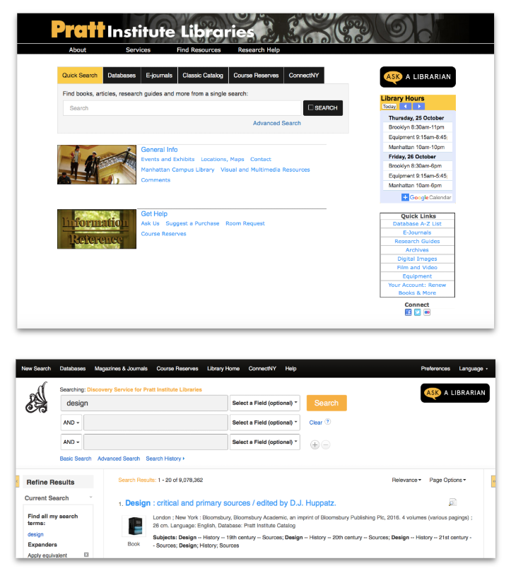
The main navigation is not global throughout. Students have to go back to the home page to use the navigation.
Students struggled navigating through the website as it was difficult for them to understand the content within different Labels.
BOOK FINDING
Difficulty in understanding the exact location of the book within the library
Majority students knew what the call number is for, however, they did not know how to use it to find a book by themselves. “I would take this number and take it to a staff to help me find it
Search results do not show version or edition.
CONTENT
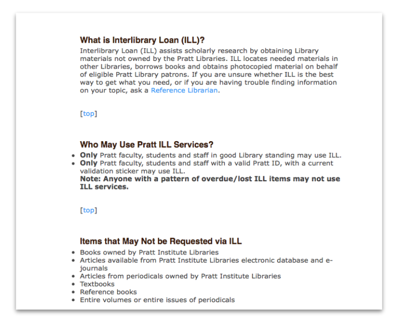
Service description (ex. Inter-Library Loan Description) uses too many jargons.
Heavy textual Content.
SEARCH BAR
The search bar is usually the first tool of action when searching for a book or image.
Users believed the search bar could find anything not just books, resources, but also library events.
VISUAL LAYOUT
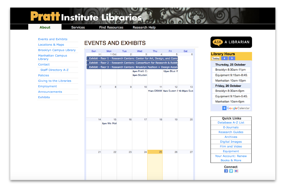
Users found the library’s event calendar difficult to understand.
Each database has different design/ layout even if some of them belongs to pratt.edu system.
We put the task observation findings on a spreadsheet. The quotes were recorded to help us remember every detail.
LIBRARY COMPANION APP
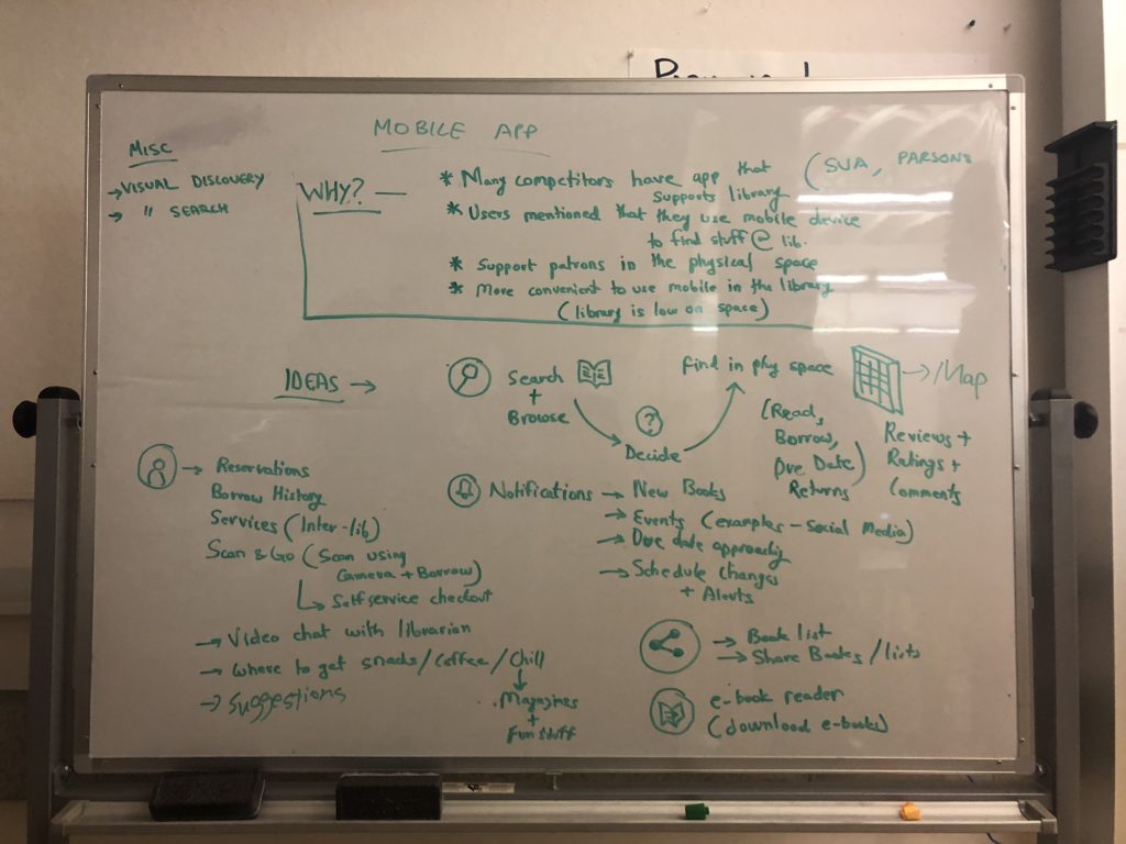
We finished all the research in 3 weeks. Then, it’s time for us to decide what we want to create and what we need to change to the current libraries. We did the brainstorm and came up with several keywords. After the discussion, we decided to divide into 2 groups – website redesign & library companion app design. Since I already worked on a library website project, I joined the companion app team.

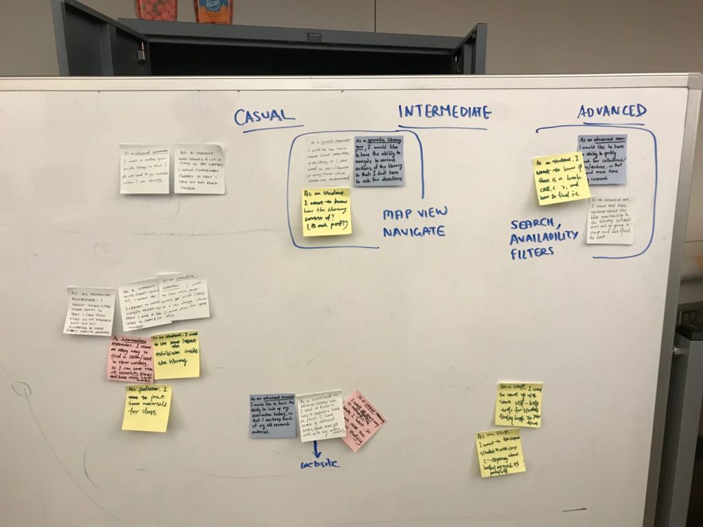
We created a set of features based on what we learned from the user research. Then, we prioritized the features with the persona created by the interview/survey group.

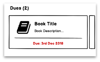
The wayfinding and librarian assistance could be the most prior features in the companion app. We were also thinking about self check-out service and notifications of the due date and events. A search bar could function as a book searcher as well as a service searcher. After a series of selections, we narrowed everything down to these key features below:
- Support patrons in the library (Searching, wayfinding, exploring etc.).
- Reduce time and effort needed for hand holding.
- Quicker and more effective workflows for patrons.
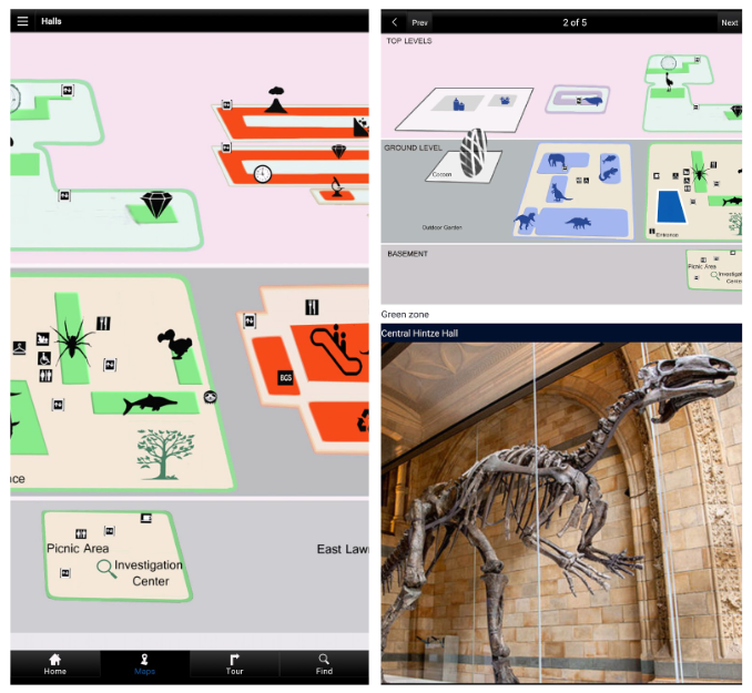
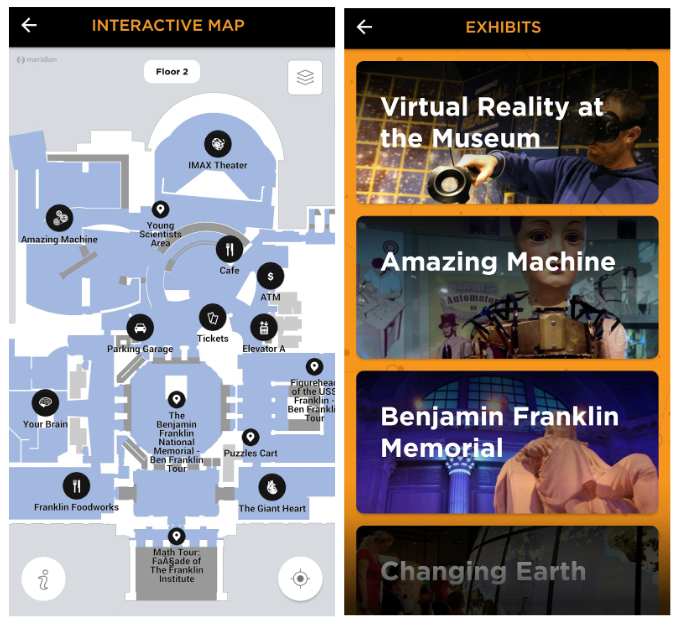
The way to show the map is a very important factor that influences the user experience. We found 2 apps which are doing great jobs on the map – Franklin Institute and Natural History Museum.
These are what we learned from these apps.
- Map View needs to be interactive.
- User’s Location needs to be displayed on the map – Bluetooth functionality can be leveraged for accurate indoor location.
- Let the user choose the floor.
- Let the user view details of map locations.
- Show schedule & events.
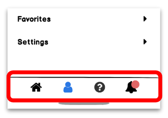
- Easy access navigation in the bottom bar.
WIREFRAMES
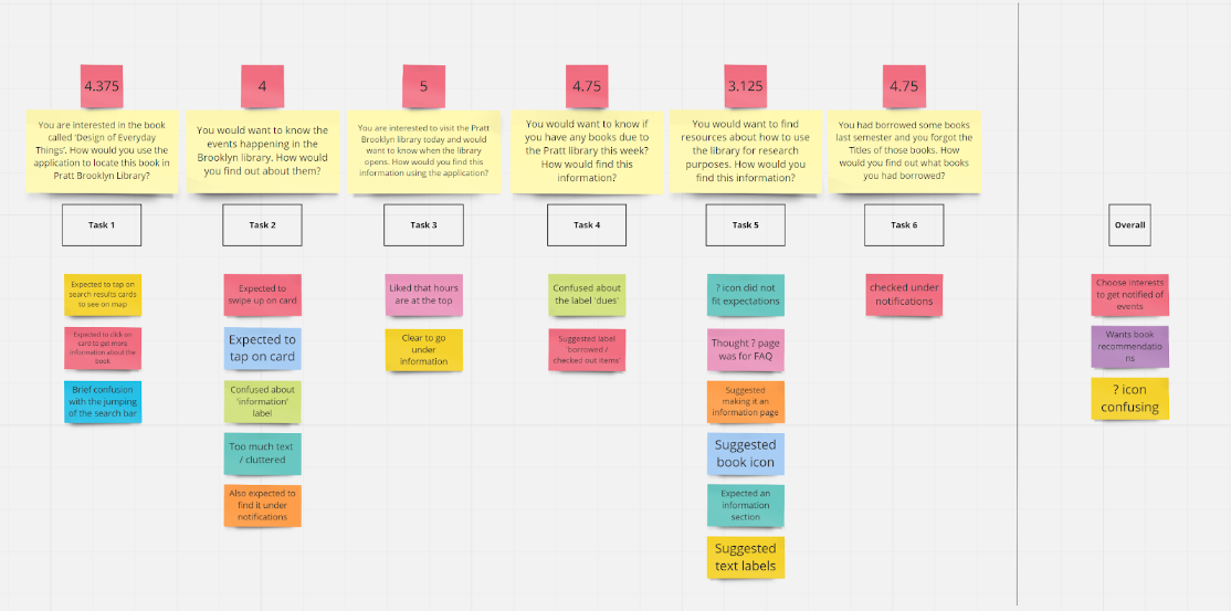
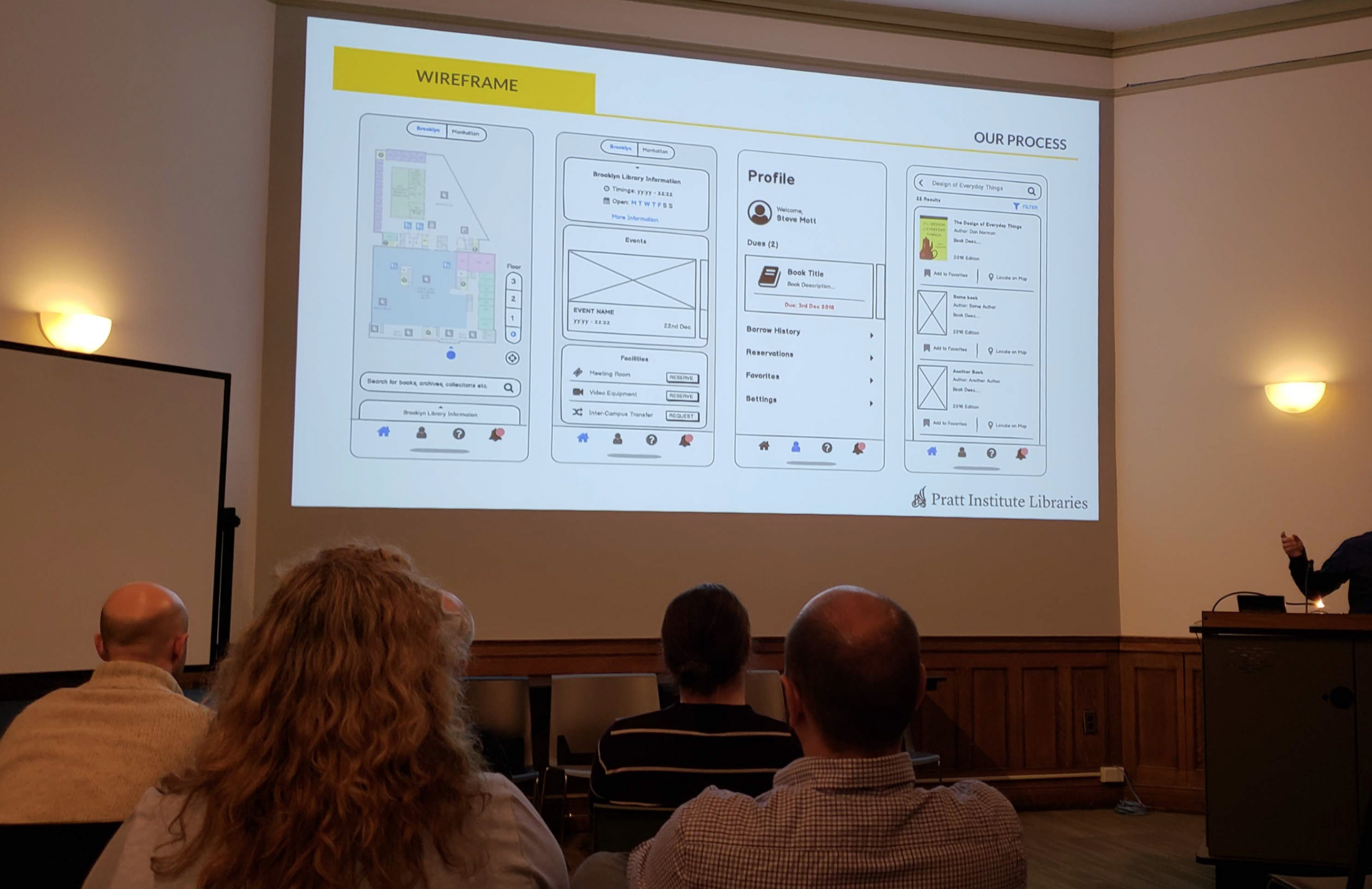
Then we made the wireframe and conducted user testings with 8 users. The testings were based on the tasks that could represent the minimum viability of the app proposal.
We used the affinity maps again to sort the user testing feedback. Since there is currently not a mobile app for any Pratt Institute services, the feedback was really positive. Here are some quotes:
“This app covers pretty much everything.”
“I would definitely download it.”
“It is well structured.”
However, there were still some problems we needed to resolve to make it better:
MAP DESIGN
After the wireframe, I decided to focus on the map design which is the core of the wayfinding system.
CURRENT MAPS
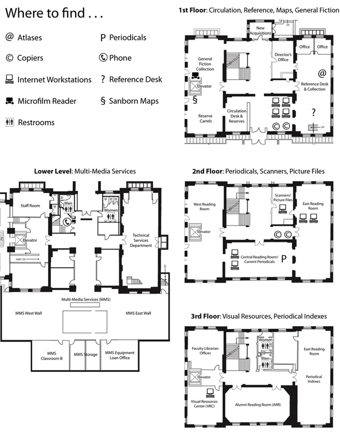
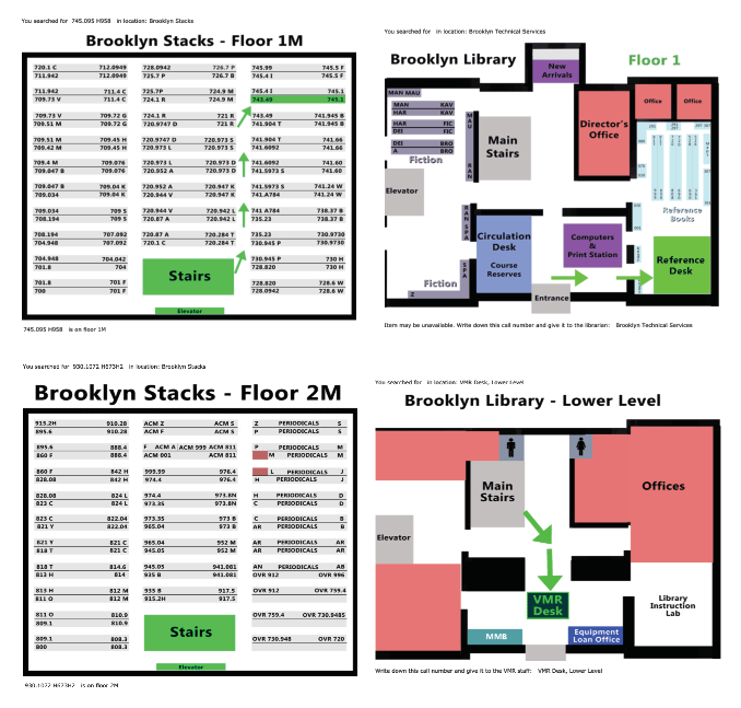
I searched on the current Pratt websites and asked the librarians to get as many versions of maps of Pratt Libraries as possible. Then I got three versions. It was interesting because they are all currently available to students in different ways but they all look different.
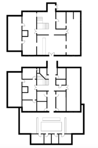
This is the earliest version I could find. It was a very professional map with very detailed architectural elements which are not necessary for regular users. The signage was good but there was a lack of consistency and colors which could help users read the map more quickly. Also, it didn’t include the stack area of the library which is very important for users who are looking for books.
This map was shown on the old version Pratt Library website which is still accessible online and actually preferred by users who have been used to it. It shows up with every resource entry in the search results. The color was clear although it could be better. It gave the users the position and the way to the specific resource they are looking for which is very helpful for anyone to find the way in the library but there are some factors that are “blocking” users from using it: This feature is not available in the most updated search engine which is the default search engine; Even if users use the classic search engine, the button to accessing this map is too small to find on the website.
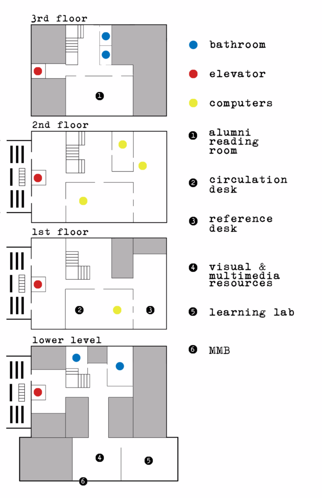
This was the latest version Brooklyn library map given by the librarians. I was surprised that they used this instead of the earlier ones. Compared to other maps. This one had a worse signage system which only used colors and a few numbers to differentiate the areas. It reduced a lot of details from other maps. It tried to provide a clear view but obviously, it’s not a great map.
MAP ITERATIONS
After looking at these maps, I started to create the new map for Pratt Brooklyn Library. The first question was to determine the complexity of the map. I did a few iterations while getting feedback from both users and stakeholders.
DRAFT 1
This was the first draft I created. I made the outer wall thicker than inner wall to differentiate the functions. I hadn’t added any colors and signage to the map yet. But the interesting feedback from a city plan student was that the showing the windows on the map could be really helpful for people to locate where they are. Also, the users seemed not to like different weights of the walls.
DRAFT 2
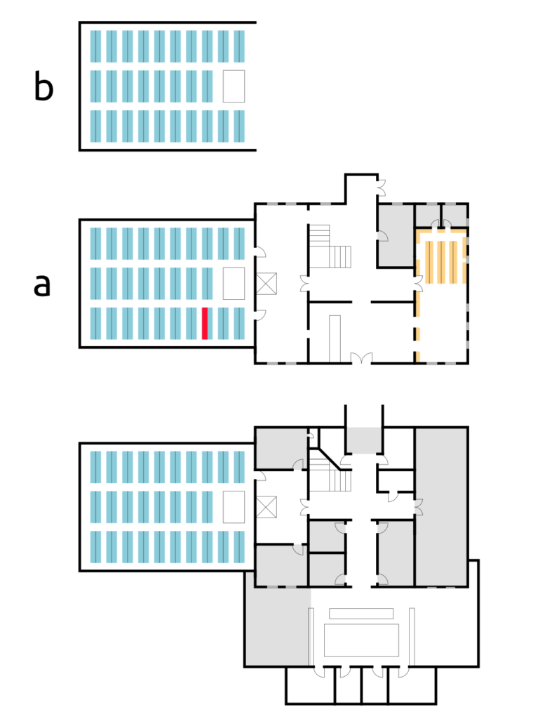
I added colors and the positions of stacks by looking at the physical space as well as the old maps. I added windows and made the walls the same weight. I also marked the office areas which are usually not accessible to students with grey. The tricky part was the arrangement of floors of stack areas are different from the main hall. There are 5 floors of the stacks and 4 floors of other. I put a subfloor on the top of the stack area and put the letters on the right to differentiate them.
UPDATED ITERATION
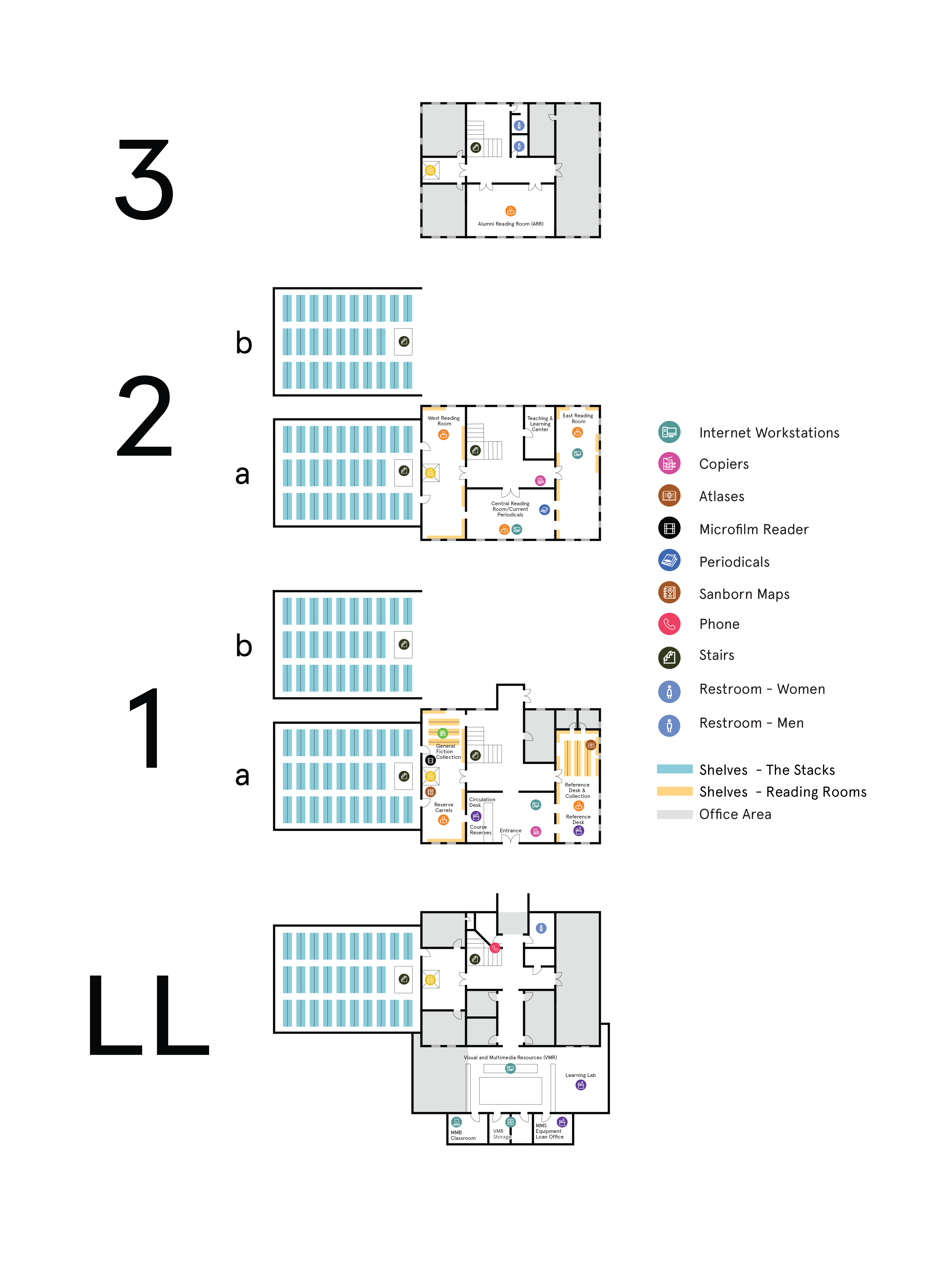
After doing some research on the names of areas and asking for suggestions from librarians, we made this final version of the library map. The librarians didn’t give any feedback about the design, instead, they corrected some structural problems. The map could be used either physically (print) or digitally (on mobile or desktop screen). The services and rooms are differentiated by both color and icon.
COMPANION APP
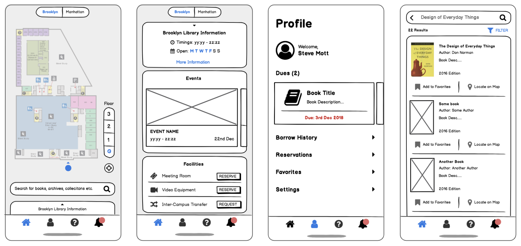
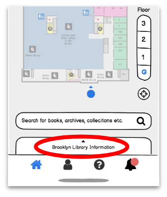
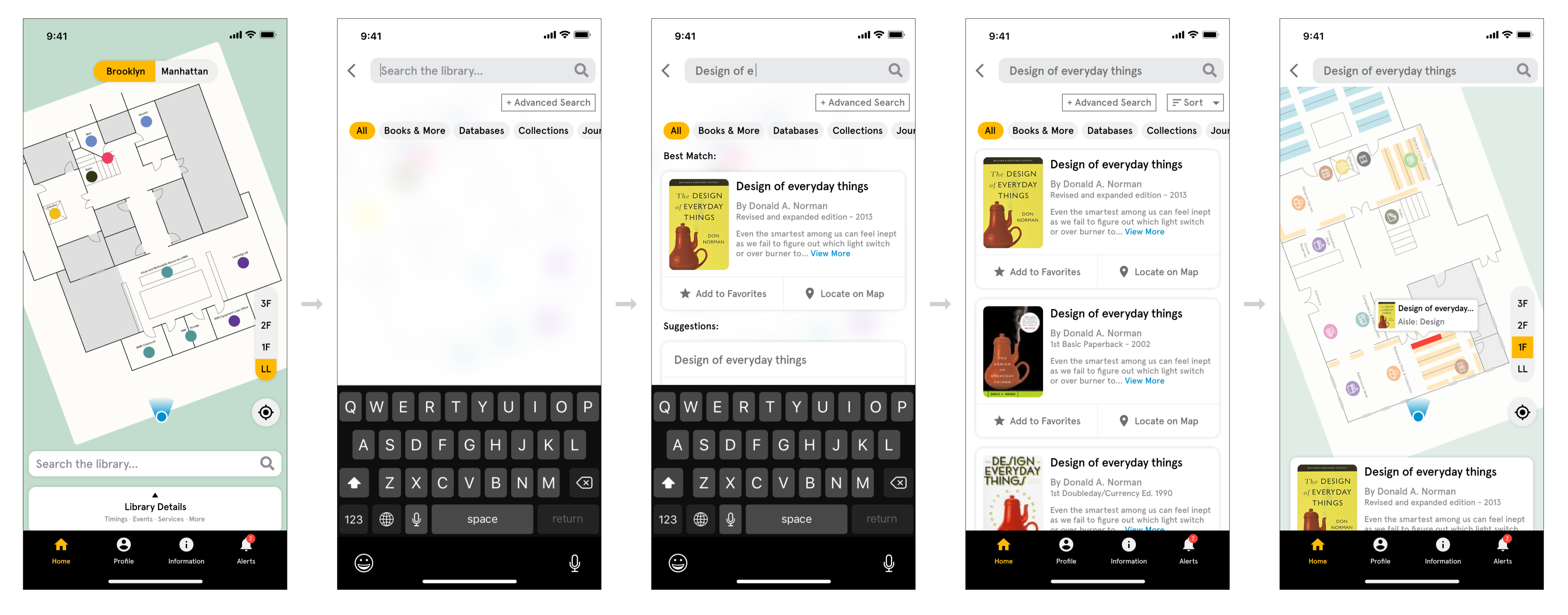
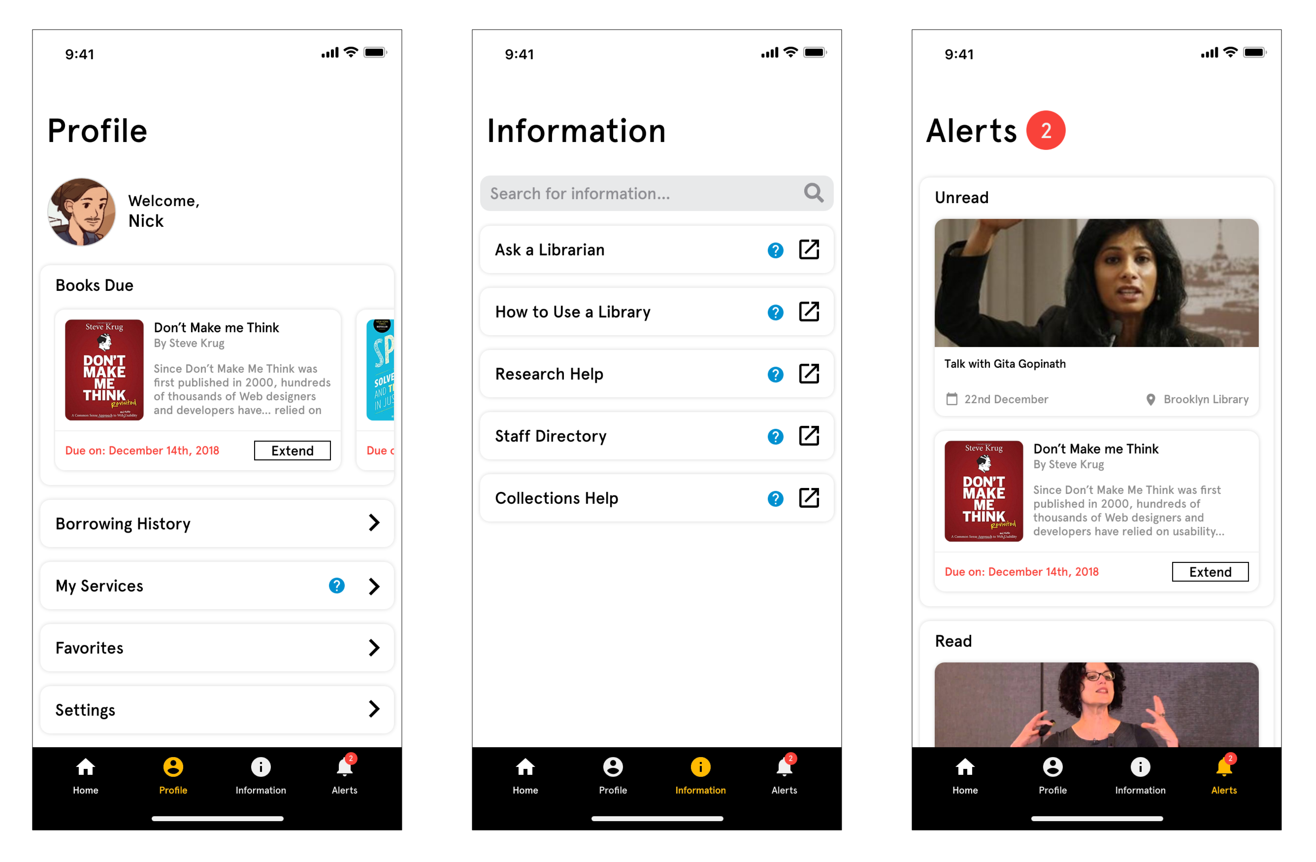
The map is the main feature of the mobile companion app. It is always on the home screen every time the users open the app. Then users can switch between Home, Profile, Information, and Alerts. On the home screen, the users can see where they are on the map and search the resource with the search bar. They can switch floors using the sidebar and switch campus using top bar. Users can see which area the resource they are searching is at by tapping Locate on Map.
Click the image below to play with the interactive prototype.
MEASURING SUCCESS
We presented the research and design process to the stakeholders and received strong positive feedback from them. They were really impressed by the effort we put and the quality of the design. Below are some of the key feedback from stakeholders.
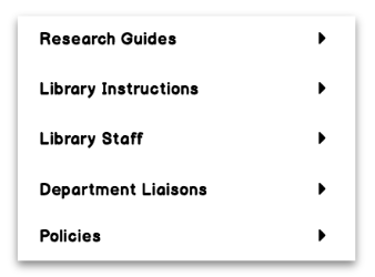
- Labels for – ‘Library instructions’ should be more in line with the content strategy team’s defined tone
- Having a splash screen for the app is a must to showcase our branding/logo
- Adding search filters is very important to assist with finding things quickly
- Borrow history needs to be kept locally on-device rather than on the server due to privacy concerns.
Also, librarians asked some technical issues including the accuracy of the map and the difficulty of programming, luckily, an engineering lab at Pratt was developing an interactive map that will cover the facility of the entire campus. It can be used in the companion app as well!
Thanks to the stakeholders keeping connected with us, we were able to conduct thorough research and design based on demand. Through this project, I learned how to efficiently communicate with team members as well as the stakeholders, which can help me always make sure to deliver on time and take the right action when issues come up.

