pizab
MY ROLE
UX Researcher
Visual Designer
DURATION
3 Months
OVERVIEW
Pizab is an online recruiting website for startups and designers. I started this independent project by targeting the user group of startuppers and followed up with a series of research and design. Pizab features a workflow specifically for startups and designers. It helps startups find the right design talent they need with customizable input options and an original skill test system. By far, I have made three iterations and conducted several user testings with the prototype.
USER JOURNEY
I targeted the startuppers as my user group. This user group is composed of a lot of dream seekers working in different fields who are facing tons of problems every day. By dealing with them, I believed that I could learn a lot more than design. First, I needed to know the problems of running a startup.
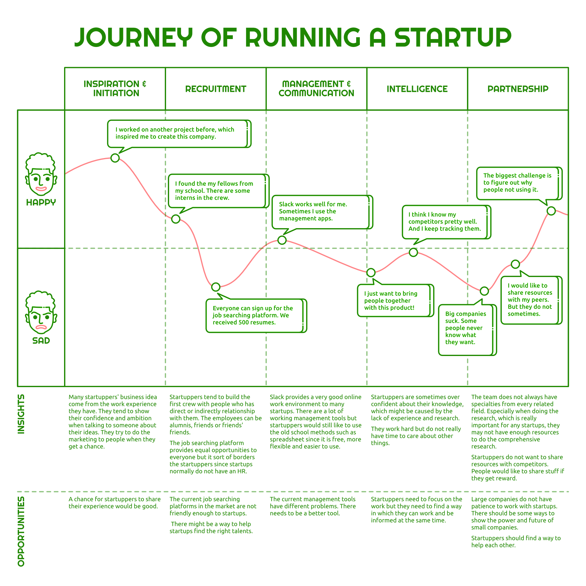
To find out the potential problems, I interviewed 5 startuppers from different areas – digital media, technology, finance, and environment. I prepared questions from 5 perspectives related to a startup company – business initiation, recruitment, company management, cognition of competitors, and partnership. I made a journey map to present the interview result.
PAIN POINTS
Although these startups are from different industries, they share some common characteristics – small and unstable team, limited budget, open workspace, etc.. According to the journey map, most problems take place in recruitment, intelligence, and partnership.

RECRUITMENT
It is hard to find the right persons to work with due to the limit of funds and human resources.

INTELLIGENCE
Startuppers are too busy to take care of what is going on in the world.

PARTNERSHIP
It is hard to find partners and even harder to communicate with them.
Among these three problems, I decided to dig into recruitment which seemed more of a foundation of the company. There are basically three aspects of recruiting problems for the startup.

MARKETING
Attract by marketing your work towards your target group.

ENGAGEMENT
Engage the candidates that have shown interest within your company.

CUSTOMIZATION
There is often limited possibility for customization on the recruiting websites.
To resolve these problems, I decided to design a highly-integrated recruiting platform specifically for startups.
COMPETITORS
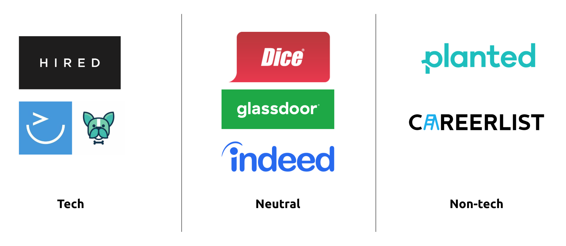
Other than Linkedin which is obviously the biggest job searching social network, there are a bunch of recruiting websites in the market. Some of them already have a considerable number of active users. There are also a few recruiting startups. However, I was sure that there was still a place for a new product that only solves problems for specific users.
While doing the competitive analysis, 2 websites raised my interests – Upwork and 99design. Their target audiences are both freelancers. Upwork is used by team builders who are looking for short-term partners or contract freelancers. On Upwork, freelancers can take the test to prove their expertise in the related field. Team builders can hire the right persons by looking at the test results. 99design has a more specific scenario. As a designer, I also used it. Recruiters post the design project with the standard, price, etc. on the platform. Designers can give their proposals. The recruiter can connect with the designer if they like the proposal.
By reviewing these 2 products, I came up with the idea that to narrow down my target audience more specifically to two user groups – startups and designers. I am a designer myself. In my past job searching experience, I received some design homework during the interviews. Honestly, I didn’t like it, especially when it was given by a small company. But I needed to know what my peers think. I talked to a few designers. Most of them have received design homework which most of them don’t like. I found that this was a good point for me to dig in. Startups usually don’t have enough human resource. When they are hiring designers, they usually don’t have a designer. But unlike big companies which can offer a learning chance to entry-level designers, they want to make sure that the person they hire can create value immediately. The problem is that they don’t test the candidates in a proper way. The designers I talked to told me that they received the homework from a startup that is “redesign our homepage.” What I needed to do was to find a better way for them to give design homework. What Upwork and 99design are doing could be a good example of how to do it. So I decided to design a design assignment system for startups to recruit designers.
SERVICE BLUEPRINT
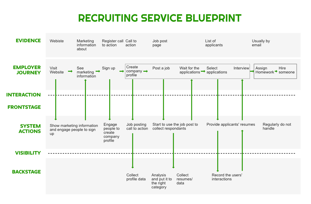
I created a service blueprint for the regular recruiting process of hiring a designer. In this process, I want to make the most changes to the last 2 steps – assign homework and hire. On the popular recruiting products, this process is always operated by the recruiter offline. My goal is to regulate this process and make it along with the online procedure.
I also set up a secondary workflow that is from creating company profile to the interview.
LO-FI PROTOTYPE
Based on the service blueprint, I created the first version prototype. In this prototype, I created the workflow from creating the company profile to hiring a person. I used blue as the tentative color and used some visual elements from my other projects. I demonstrated the core features as well as adding some additional features for target users.
Here are some highlights of the lo-fi prototype:
- On the job post form, recruiters can optionally enter the design challenge preference if they want to give the design challenge to the candidates. The system will finalize the design challenge detail based on the preference. This is not a free service.
- The top applicants selected by the system will be shown separately from others. The recruiters have the right to see all applicants.
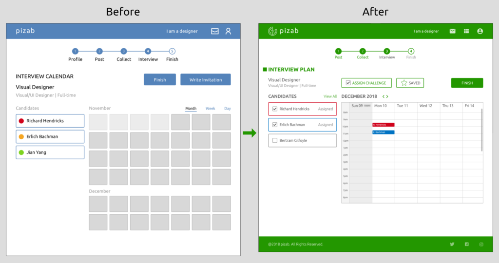
- The interview planner is equipped with a calendar view to help recruiters schedule interview quickly.
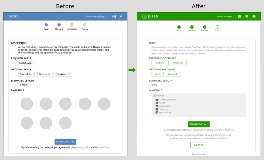
- Designers who are willing to do the design challenge can see all the details of the design challenge before starting. There is also a preview of the visual elements on the website before they are downloaded.
USER TESTING & ITERATIONS
After finishing the first version MVP, I conducted user testings with 5 startuppers, 4 designers and 2 engineers. They gave me feedback from different professional perspectives. While doing the user testings, I tried to keep the prototype updated based on the feedback.
Here are some major changes I made from version 1 to version 3:
ONBOARDING
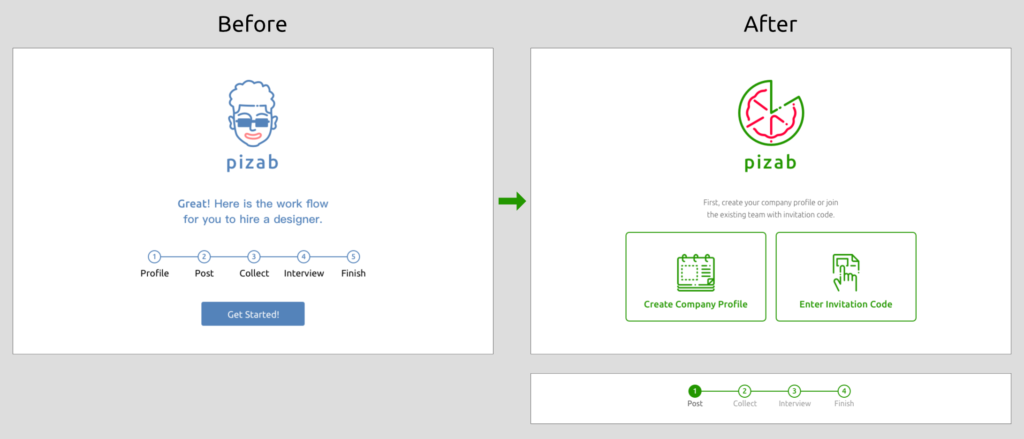
On the lo-fi prototype, there were 5 steps in the recruiting procedure. A user reminded me that once the company profile is created, it does not need to be changed every time when you want to post a job. So I separated the company profile editor from other 4 steps.
“You can make this timeline have a different look, so users will know the priority of each part.”
Also, users want to join an existing team so that they can view the recruiting process done by co-workers. I added a join existing team option on the onboarding screen.
“Sometimes I want my partner to see the candidates on my screen.”
DESIGN CHALLENGE SETUP
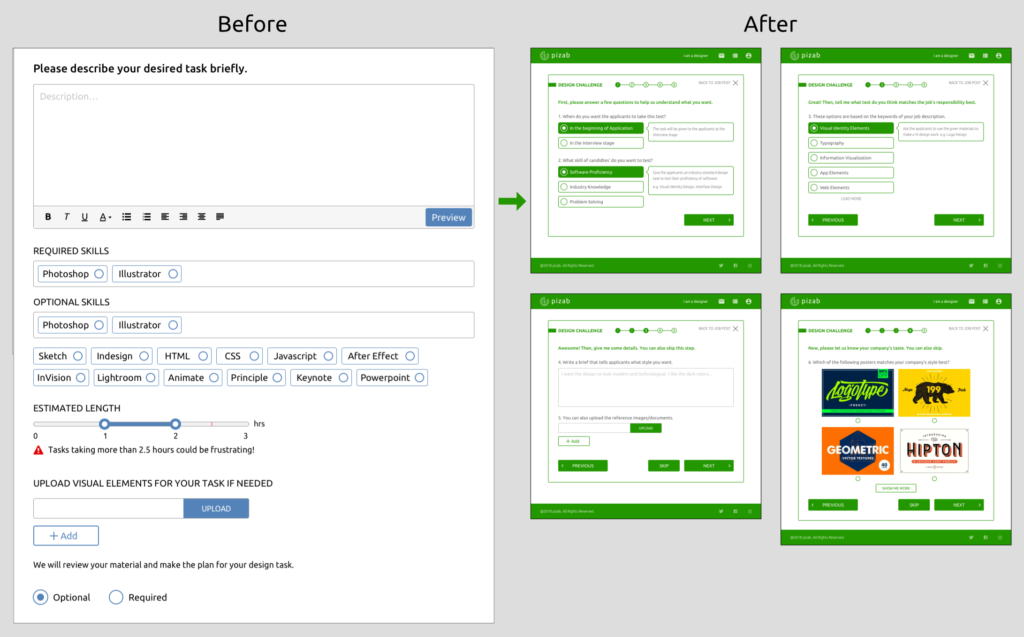
This is the most tricky part. In the first prototype, the preference form was shown up as a popup. Users were asked to enter their description, preferred software, and estimated length. But some options were repetitive compared to the information they input above. But technically, the description would require too much human operation. According to the testings, users think the challenge setup process should be a separate screen, the repetitive options should be optimized. In the 2nd iteration, I changed the preference options to make it require a simpler algorithm. However, users still want more freedom. They still want to enter their own preference. I came up with a neutral solution – “Skip” buttons. In a word, users need to be helped by the system, but they also want some freedom.
“I would want to hide the task till the interview.”
“If I saw these pictures but none of them I really like, then I would just leave.”
“I want to write some of my own ideas.”
INPUT OBJECTS
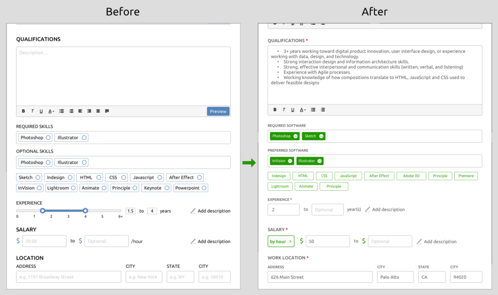
I adjusted some input objects on the latest version based on the user testing feedback. The changes include making same type forms consistent, added stars on must-fill blanks, and changed the layout to improve usabilities.
“I think it would be better if you made those in the same format.”
“What if it’s a contract job?”
“I would just put the unit before the blank.”
APPLICANT LIST
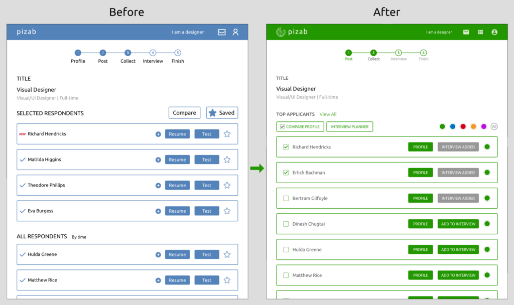
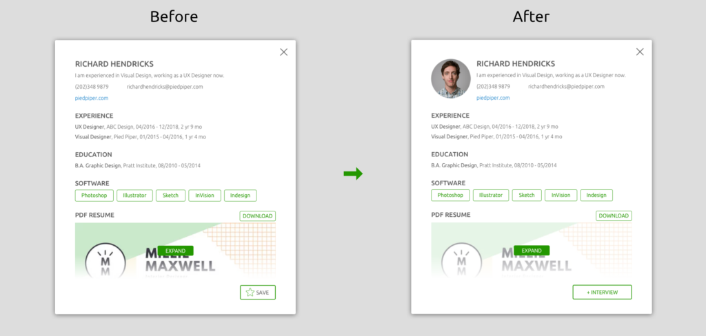
On the applicant list, recruiters can view top applicants selected by the system and all applicants at will. According to the user feedback, there doesn’t necessarily need to be a “cart” before they add people to the interview planner.
“I mean, you can even buy things by ‘one-click’ on Amazon.”
“I would say ‘no double-check.’”
Users want to sort applicants so they don’t get lost the next time they look at the website. They can also share specific applicants with their partners by categorizing them. I added a color filter. The users can mark applicants with colors and click on the color filter to see specific applicants.
“If my partner was looking at this, I would want to be able to show him the candidates I selected. Just like what Monday.com can do.”
DESIGN CHALLENGE PREVIEW
Employers want to hide the design challenge details before the candidates start the challenge. So, on this screen, I changed the visual material from image preview to only file names.
“What if I don’t want them to see it. It could be unfair to other candidates if some of them saw this earlier and spent more time looking at them.”
HI-FI PROTOTYPE
The user testings helped me optimize the prototype. On this prototype, I sampled good features from some brilliant applications in the market. For example, the idea of the timer on the homework screen was from my experience of using those project management tools. The interview planner screen referenced calendar apps.
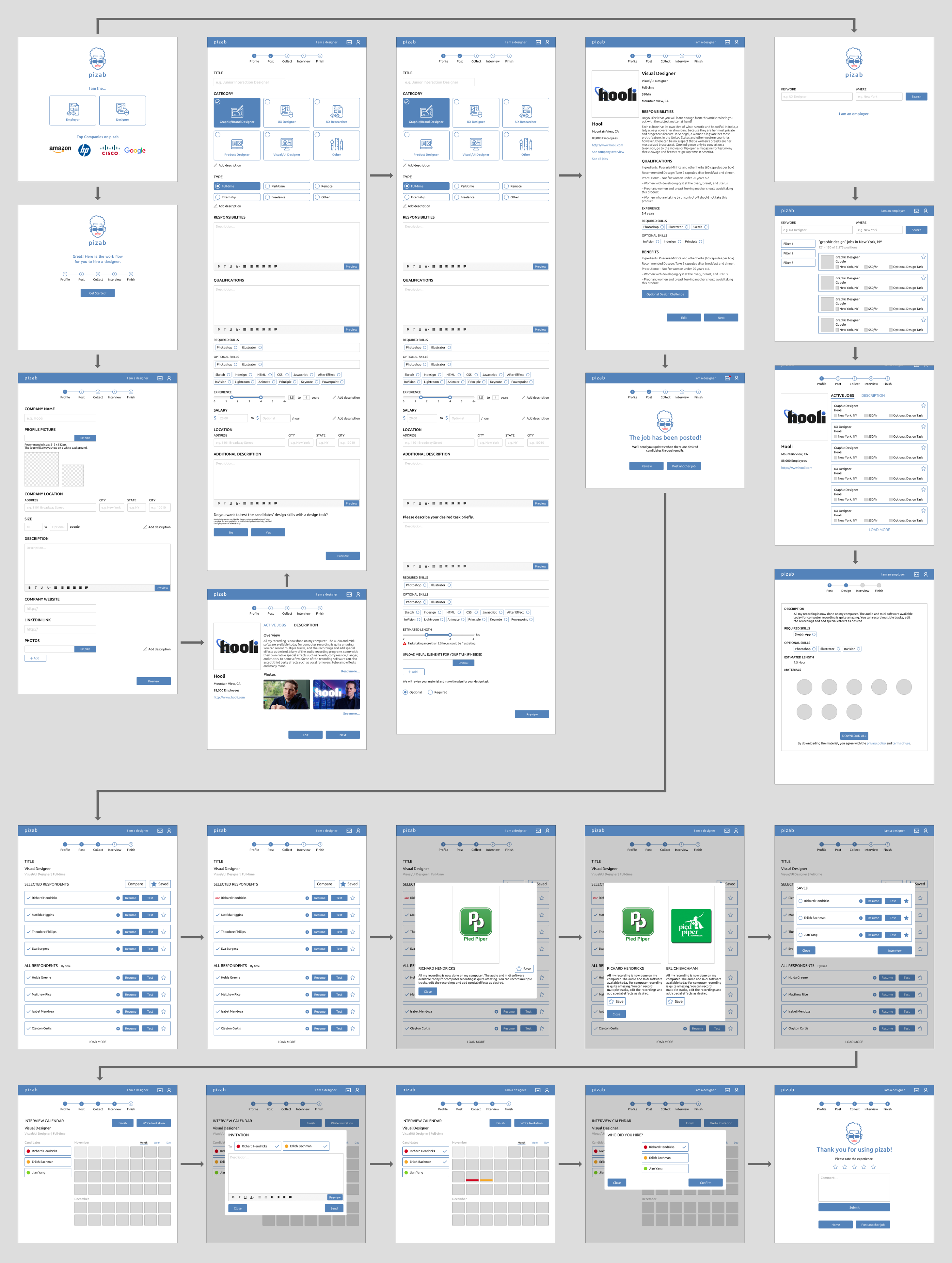
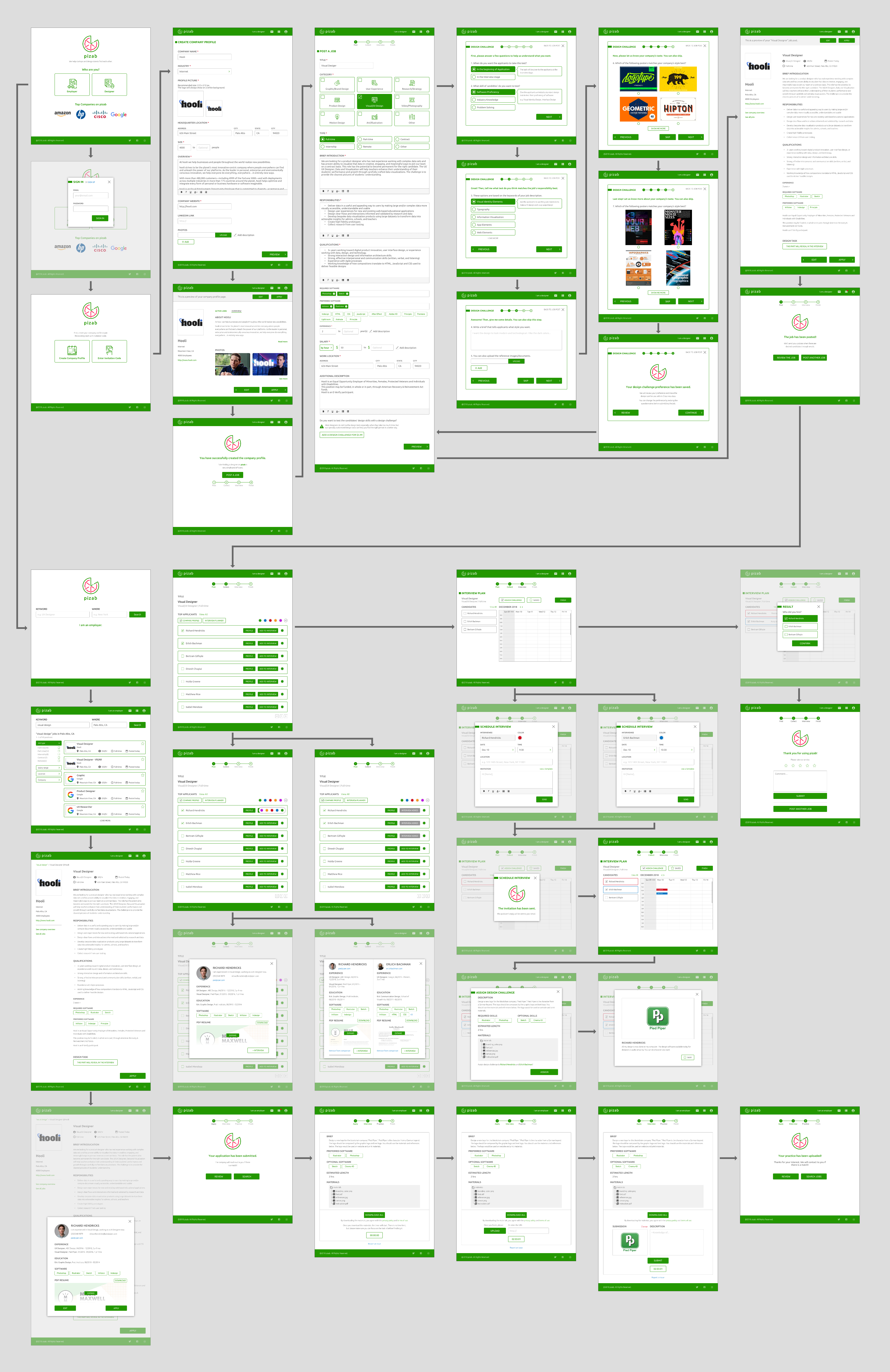
Here are the screens including a full workflow of recruiters and portion of a workflow of designers.
Please feel free to check out the interactive prototype:
NEXT STEPS
The latest version still has some known problems to be solved. From the employers’ perspective, the design challenge setup process itself is obviously already a huge project which needs more research. The pricing strategy also needs to be changed. From the designers’ perspective, the workflow needs to be better completed.
I earned not only design experience through this project. The recruiting is never a simple thing. Every industry has a very different standard. Other than a product, the research process and the conversation with so many startuppers are definitely a valuable learning experience.

